About the Author:
Diana Hlevnjak brings over 20 years of experience in graphic design, branding, and illustration. Her Master’s degree in Fine Arts continues to inform her approach to visual communication, blending artistic exploration with practical design thinking. Her work spans branding, packaging, game design, and illustration, always centered on building cohesive, thoughtful visual systems across digital and print media.
When you start a new brand, it is natural to look at what already exists. You look at competitors, collect references, save logos you like, and build a moodboard. You might even look for a brand designer who has already worked in your industry. Learning how to build a brand often starts with that research, and it shouldn’t end there.
It makes sense. You want someone who understands your market.
The problem is that if you look too closely at what everyone in your category does, your brand can end up looking like everyone else. A strong brand needs to understand its category. It doesn’t always need to look like it.
Learn your category’s visual language before you move away from it
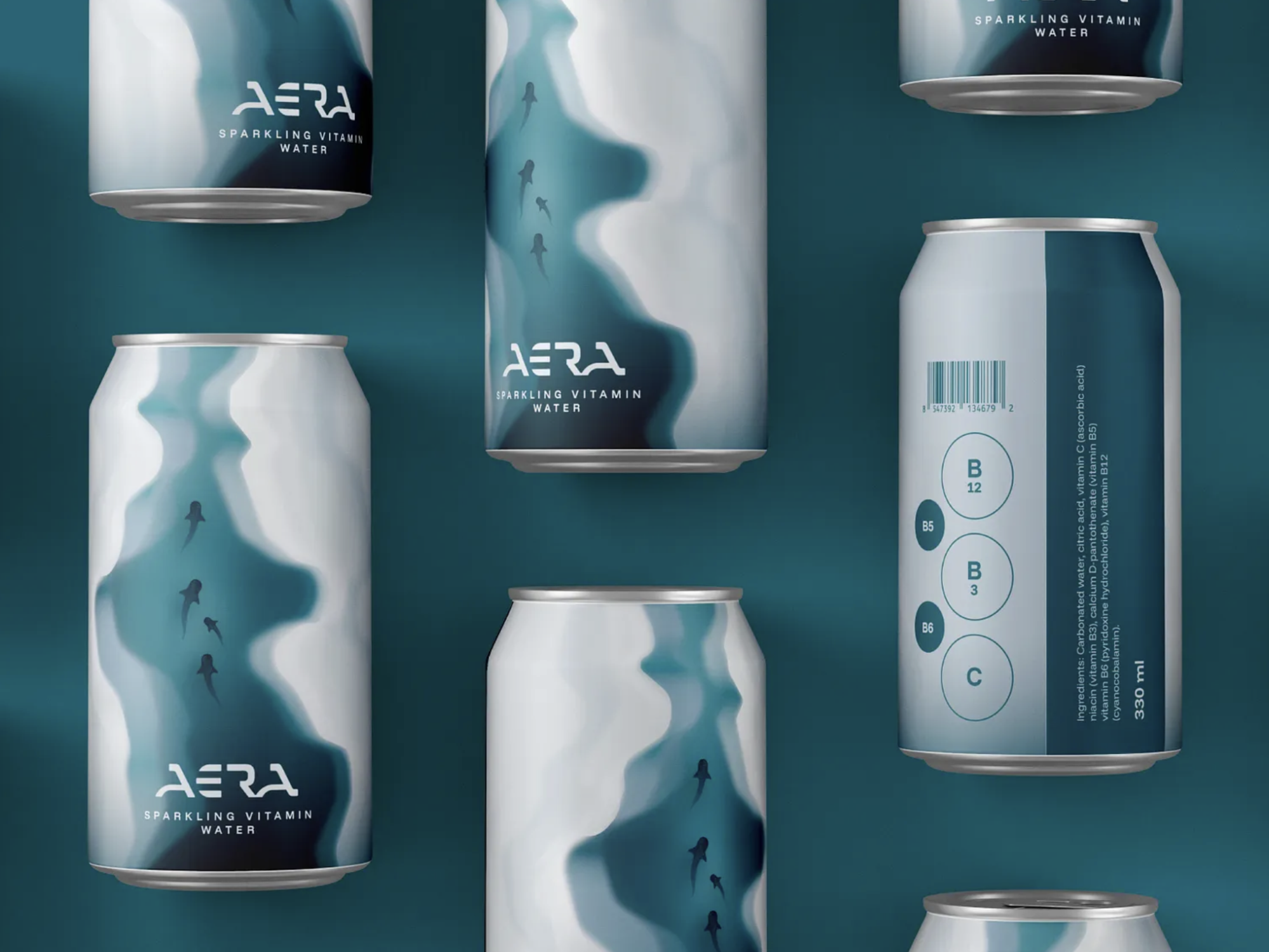
Every industry develops its own visual language. Coffee brands lean toward certain aesthetics. Technology companies have their own conventions. Beauty, wellness, hospitality, finance, food, and fashion all have patterns that become familiar over time.
These conventions are useful. They help people understand at a glance what kind of product or service they’re looking at.
Understanding that visual language and repeating it are two different things. If every competitor uses the same typography, color palette, symbols, and visual style, following them too closely can make your brand feel both appropriate and forgettable.
The aim is to find your difference, which rarely means being completely different. Start by understanding what your category expects. Then decide where your brand follows those expectations and where it moves away.
Start with the problem before the logo
Before you brief logo designers, a few questions need answers:
- Who are you trying to reach?
- What makes your business different?
- What should people feel when they encounter your brand?
- What does your category already look like?
- Where are the opportunities to do something differently?
- What needs to stay familiar, and what can be unexpected?
These questions create the foundation for every design decision. Without them, it is easy to reproduce whatever is popular right now.
Stepping away from coffee category clichés with ALTITUDE
ALTITUDE is a specialty coffee brand identity I created for enthusiasts who appreciate quality, craftsmanship, and origin. The collection covers three single-origin coffees from Ethiopia, Colombia, and Guatemala. My work covered the logo and packaging design.
Coffee is a category full of familiar imagery: beans, cups and vintage badges. The challenge was to communicate premium quality through subtle design choices, while keeping three distinct products connected in one visual system.
I built the identity around altitude, a defining characteristic of premium coffee cultivation. Instead of literal illustrations, I used abstract, flowing forms inspired by mountain contours as the core visual language. A custom wordmark, a restrained color palette, and minimalist typography create a calm, contemporary aesthetic.
Each pouch has its own color composition, roast profile, and origin information. The goal was a line that feels cohesive while each origin keeps its own personality, without the beans, cups and badges the category usually relies on.
Look for inspiration outside your industry
This is one reason I don’t believe a designer’s portfolio should be judged only by whether they have worked in your industry.
I often notice that clients looking for a designer ask to see work similar to what they need. A restaurant wants to see restaurant branding. A skincare company wants skincare branding. A technology company wants technology branding.
There is logic behind this request. You want reassurance that the designer understands your world. There is another way to look at it, though. Sometimes the most interesting solution for your brand comes from somewhere completely different. A designer who has worked across many industries has faced different problems, audiences, visual languages, and ways to communicate an idea.
Borrow principles from other categories
Imagine you’re launching a premium tea brand. You don’t need a designer who has already created five tea brands.
You might find inspiration in how a luxury fashion brand uses typography, how an architecture studio builds a visual system, how a fragrance brand uses negative space, or how a publishing house organizes information. None of those businesses sell tea, and that is exactly why the references can be useful.
Judge a designer’s portfolio by how they think
When evaluating a designer, look at their work as a whole. Don’t only ask whether they have designed something exactly like your business. Also ask what kinds of problems they have solved.
Look at the variety, and at how they approached different audiences. Check whether they can move between visual languages, and how they use typography, color, illustration, symbols, patterns, and composition. Above all, look for the thinking behind the work.
A designer who has created identities across very different industries brings something valuable: the ability to see your category from the outside. That perspective makes it easier to spot opportunities that someone immersed in the category might overlook. In my own branding and illustration work, projects range from beverage and food brands to law practices and SaaS platforms.
Use competitor research to find your place
Competitive research matters. A designer should understand the landscape your brand will enter. That research should help answer “Where do we fit?” It shouldn’t automatically answer “What should we look like?”
If ten competitors use muted neutrals, you don’t have to use a bright color. If everyone has a minimalist wordmark, you don’t automatically need an expressive logo. If everyone uses an illustrated mascot, you don’t need another one just because it is common.
Sometimes differentiation is obvious, and sometimes it is subtle. It might be a typographic detail, an unexpected proportion, a distinctive visual system, an illustration language, a particular use of color, or a different way of organizing information. Quiet differences can be just as recognizable as loud ones.
Give your designer room to surprise you
If you’re hiring a designer, it is tempting to arrive with a specific picture of what you want. You may already have a favorite font, a color palette, a symbol, a few competitor brands you admire, and a Pinterest board full of references.
Those things are helpful. They communicate your taste and show a designer what resonates with you. Treat them as a starting point, and leave room for the destination to change.
Sometimes the most valuable thing a designer brings is a connection you wouldn’t have made yourself. It might come from another industry, a visual principle you hadn’t considered, or a solution that looks nothing like your references but still feels more like your brand.
That is part of the value of hiring a designer. Good design goes beyond executing the picture already in your head. It helps you discover a visual identity you might not have reached on your own, one that makes your brand recognizable, relevant, and distinctly yours.
Find more Community stories on our blog Courtside. Have a suggestion? Contact stories@dribbble.com.