About the Author:
Nicolas Solerieu is a product and brand designer at Expo, working across product, web, and brand identity. Previously at GitHub and Opendoor, he’s interested in software, the web, and the strange craft of arranging rectangles for a living.
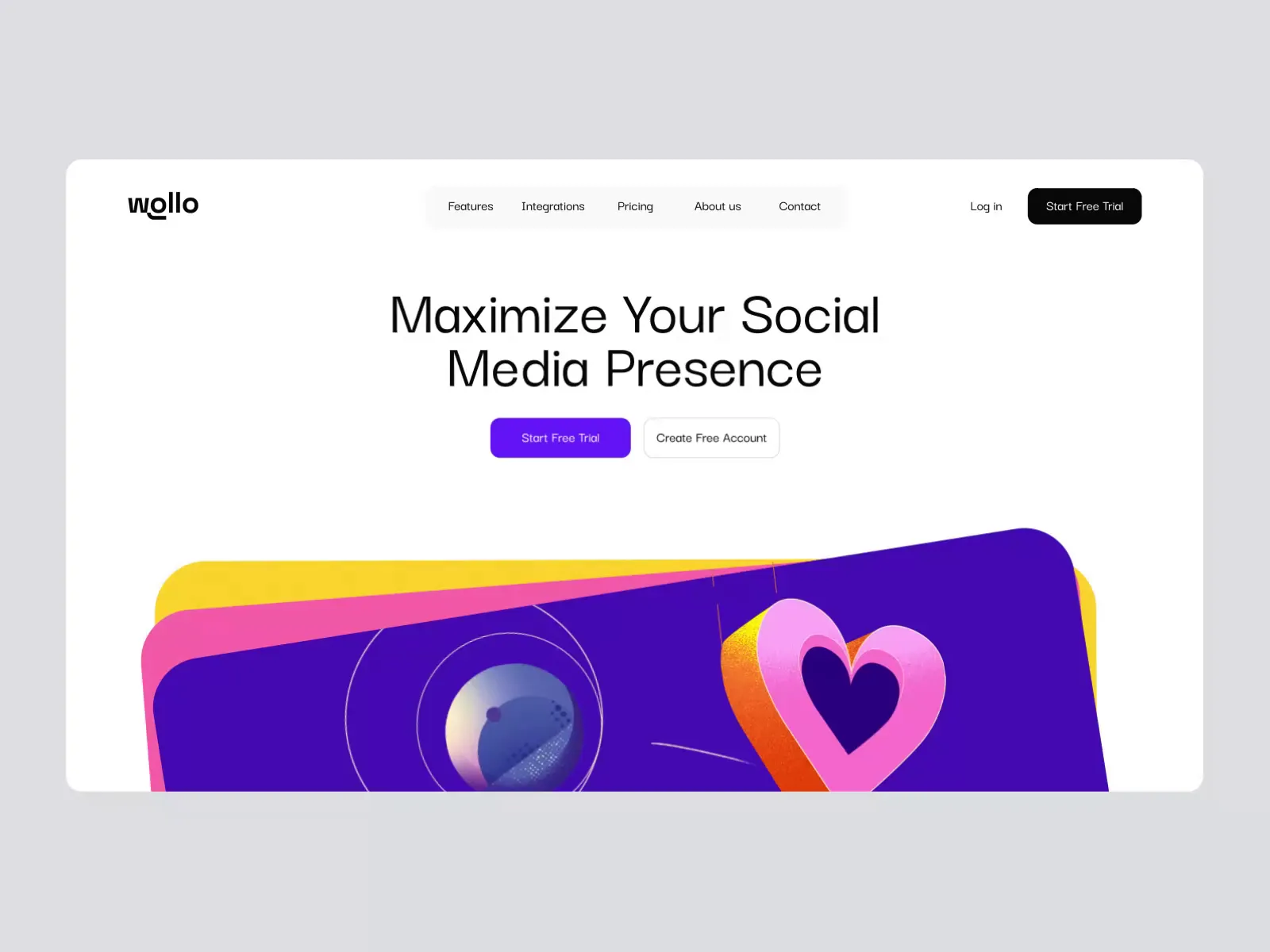
You can’t one-shot an app. The capabilities are on the table, and mature frameworks and skilled LLMs are within reach. Chances are you’ve used vibe-coded software, and noticed differences. The obvious flaws are disappearing. What remains is subtler: the gap between an AI-generated app that works and one that feels considered.
1. Build a Brand System for Your AI-Generated App
Good product design blurs the edges between brand and product. Ask an LLM, even in plan mode, and it will improvise a branding kit to suit its own needs. Even in tools like Claude Design, where you can provide a base kit, it will still create brand artifacts of its own. Illustration should be consistent, and colors and layout should create a visual continuity from marketing to product, guiding users along the way.
The various touchpoints require different fidelity. Marketing is usually higher fidelity while products tend to be more minimal and rely on color and icons alone. Infusing a product with personality and a distinct style is almost an art. It requires care, attention, and taste: human qualities that can only be amplified, not outsourced.
A brand is also a living entity that flexes beyond the system an AI can understand: employee swag, micro events, an internal sports team, fan art. These are where a product’s personality shows up in ways no brand kit specifies. Think of a brand as the set of artifacts that breathes life into your product. A simple motto is a good way to keep this in mind: “small screens, big moments.”
2. Replace Default Icons and Generic AI Illustrations
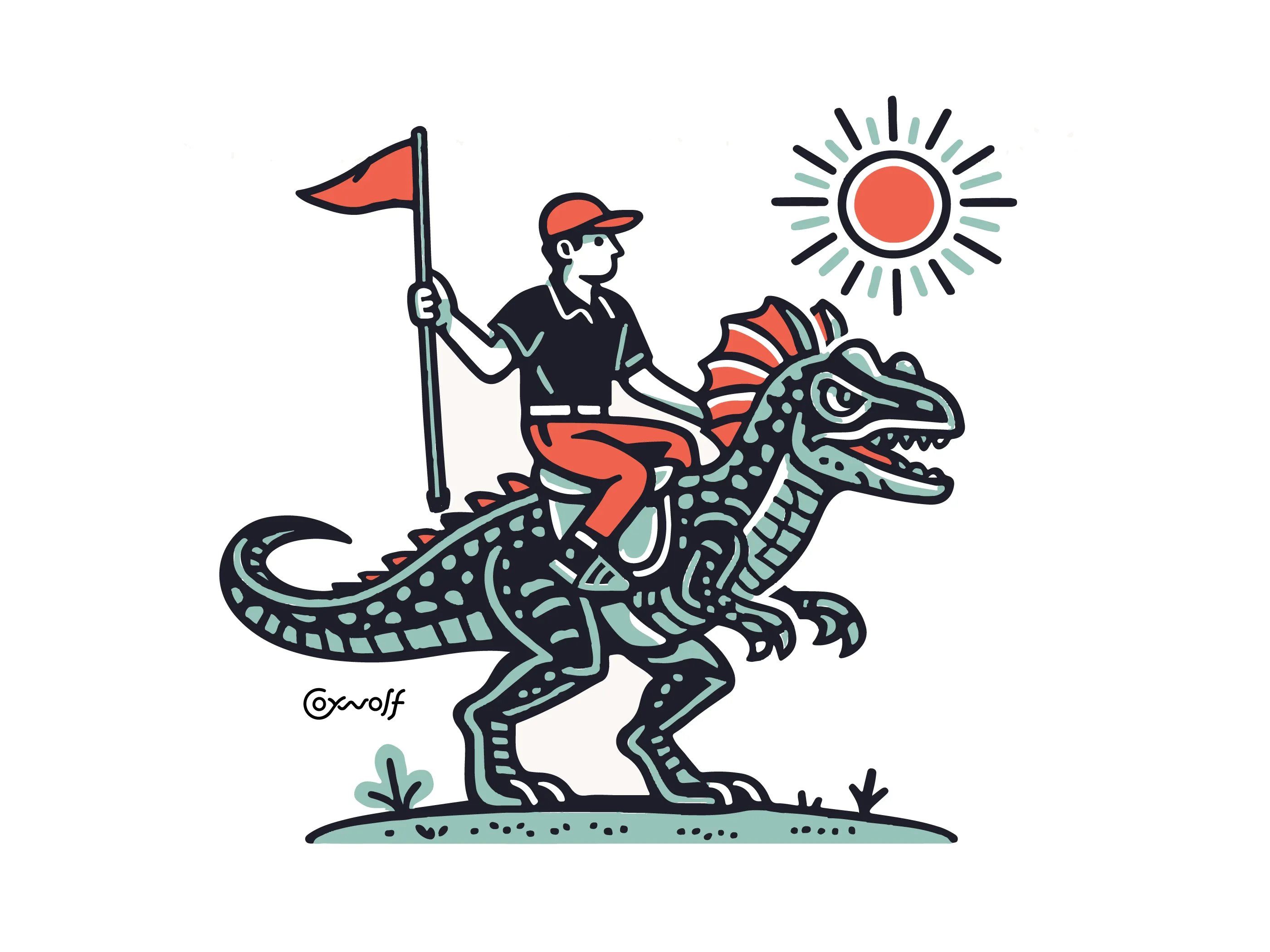
Most LLMs pull icons out of their preferred library, or invent them with SVG and CSS. Without specific direction, the result is often generic. 90% of the apps I saw use Lucide icons. It’s solid and covers most cases, but at this scale, it’s becoming the obvious default. You can do better and easily. The same goes for illustration. Certain styles and obvious quality flaws can erode trust quickly.
3. Use Purposeful, Restrained Animation in Your App UI
LLMs greatly ease the production of animation. They tend to go hard on the same attributes since CSS and SVG make them most accessible, and shaders are also more prominent nowadays. The downside is that interfaces can accumulate motion before anyone has asked for it. It happens to me all the time with all my frontend design skills loaded up by default. Animation is rarely improved by quantity. More often than not, restraint and purpose are needed on the human side to improve the quality of outcomes.
4. Test on Real Devices to Make Your Mobile App Feel Native
You may have noticed a strong enthusiasm for products that “feel native.” This feeling often boils down to performance and familiarity. Design is the experience, and ease and speed are a big part of it. Only a human can truly feel that quality, so test, test and test again. Your firsthand experience with each ecosystem matters.
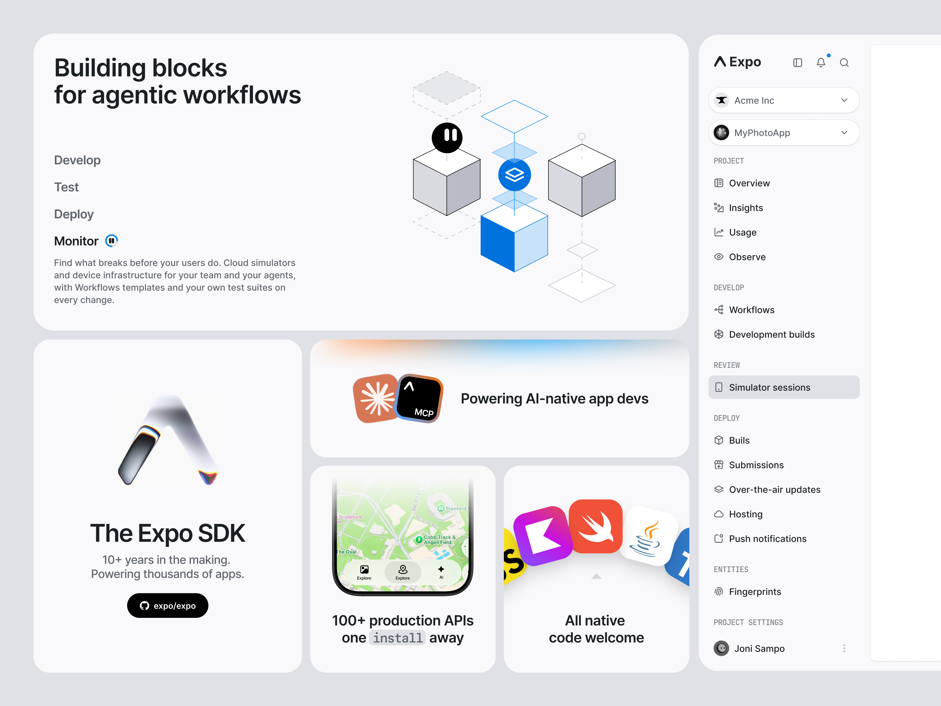
Simulators help here, too. When an agent can launch your app in a simulator, tap through flows, and test what it built, a typically painful part of the process becomes visual and collaborative. You can watch it work, spot what feels off, and steer it in real time. It speeds up the loop, but it doesn’t replace the device in your hand, so keep testing on real hardware before you call it done.
5. Enforce Design System Consistency and Visual Hierarchy
All of the above is well and good, but what often betrays a UX is inconsistency across the whole UI. LLMs are getting better at sticking to a design system, but as anyone who has worked in this industry knows, having a design system guarantees nothing. The wrong component or primitive still ends up in the wrong place. Systems are flexible, and LLMs will be only as flawed as humans.
That’s why the visual basics still need a human eye. LLMs are getting better at checking them, but human taste remains the best judge. Great visual design guides the eye so information feels effortless to digest. Contrast and visual hierarchy make the most important details pop first. Alignment and proximity keep related pieces grouped so the layout feels orderly rather than chaotic. Whitespace gives elements room to breathe, creating a balanced design that feels clean, clear, and intentional.
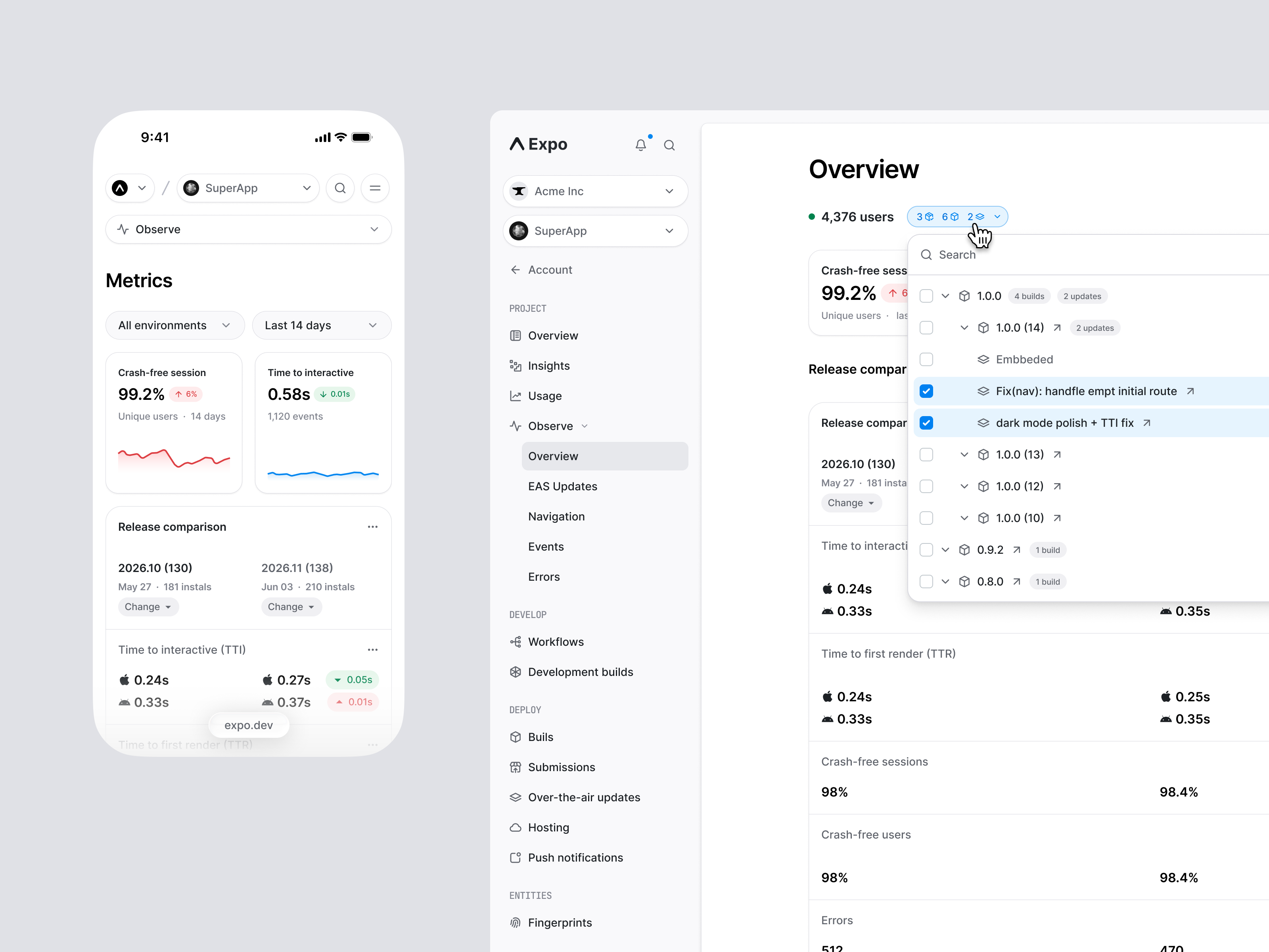
6. Plan Migrations and Involve Users and Partners Before You Prompt
Design sits at the intersection of operations, engineering, marketing, and infrastructure. Great design is often the direct product of a purposeful blend of those priorities, and that’s hard to convey to LLMs, which either wait for precise instruction or take (sometimes wild) guesses.
Some scenarios, like migrations, are more straightforward. Others require more planning and handholding. Porting over your web app to mobile? Going native? These can seem like perfect tasks for AI but often result in many edge cases. Careful review via simulators and platform knowledge goes a long way. It’s never just a design matter. I’d encourage you to think about the contingencies and holistic drivers.
The same goes for the people involved. You might have heard “don’t ship your org chart.” While a great app is a set of features, UX is the sum of all things, too many things to truly list in one blog post. Points of friction, and human shortcomings often materialize in the experience. Talking to your users, and your relationships with project partners and vendors, are an invisible yet obvious part of the design process that LLMs can’t fully replace. Sometimes they even introduce a new kind of friction.
7. Design for Error States, Empty States, and Accessibility, Not Just the Happy Path
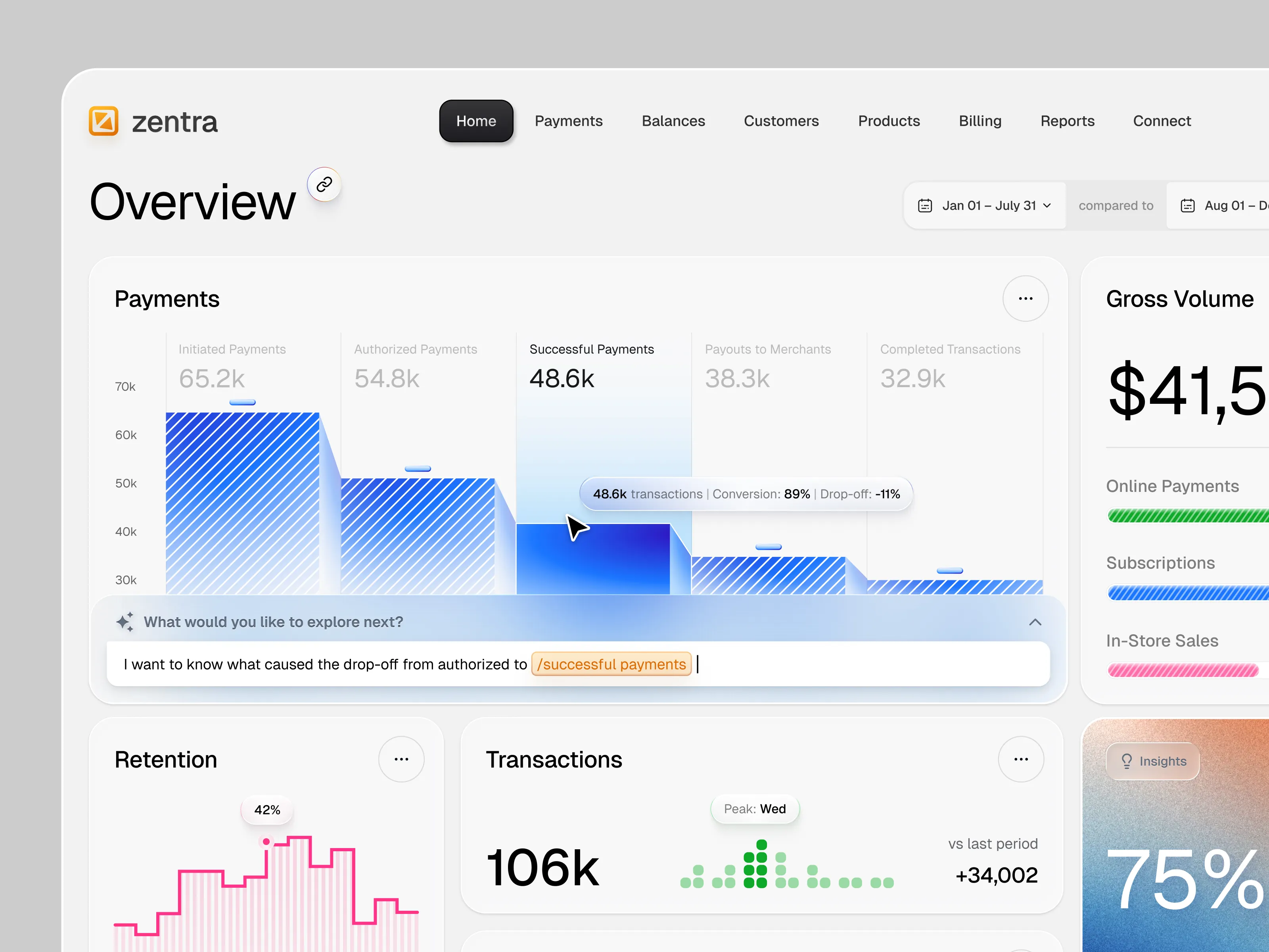
The modern product designer is not someone who starts from a blank canvas but an “Editor-in-Chief” who curates, prunes, and directs AI outputs. More like a webmaster of the 2000s than a 2016 product designer. Steering and QC is more important than ever to avoid the “Happy Path” Trap: LLMs excel at ideal user flows, but product design happens in the margins. AI frequently ignores error states, zero-data screens, dynamic text wrapping, role-based views, focus & accessibility requirements, loading indicators, and all too often, container alignment. Brand remains the wild west, and it should. That’s where the beautiful complexity of design shows.
Polish is when persistence and taste meet the craft of design. AI elevates the floor so anyone can build software, and human craft is what raises the ceiling. Since tools are becoming generalists, perhaps designers need to become generalists (again) too.
Find more Community stories on our blog Courtside. Have a suggestion? Contact stories@dribbble.com.