

About the Author:
Anthony Dutcher is Founding Partner at Vix Media Group, a Denver-based agency working across healthcare, technology and media. His team is deliberately split between agency and in-house backgrounds and runs its own infrastructure, so it has sat on both sides of the brief. He believes research should decide the design, not decorate it.
A behavioral-health website we refreshed did not need a dramatic new look. It needed a better way for people to find the right care.
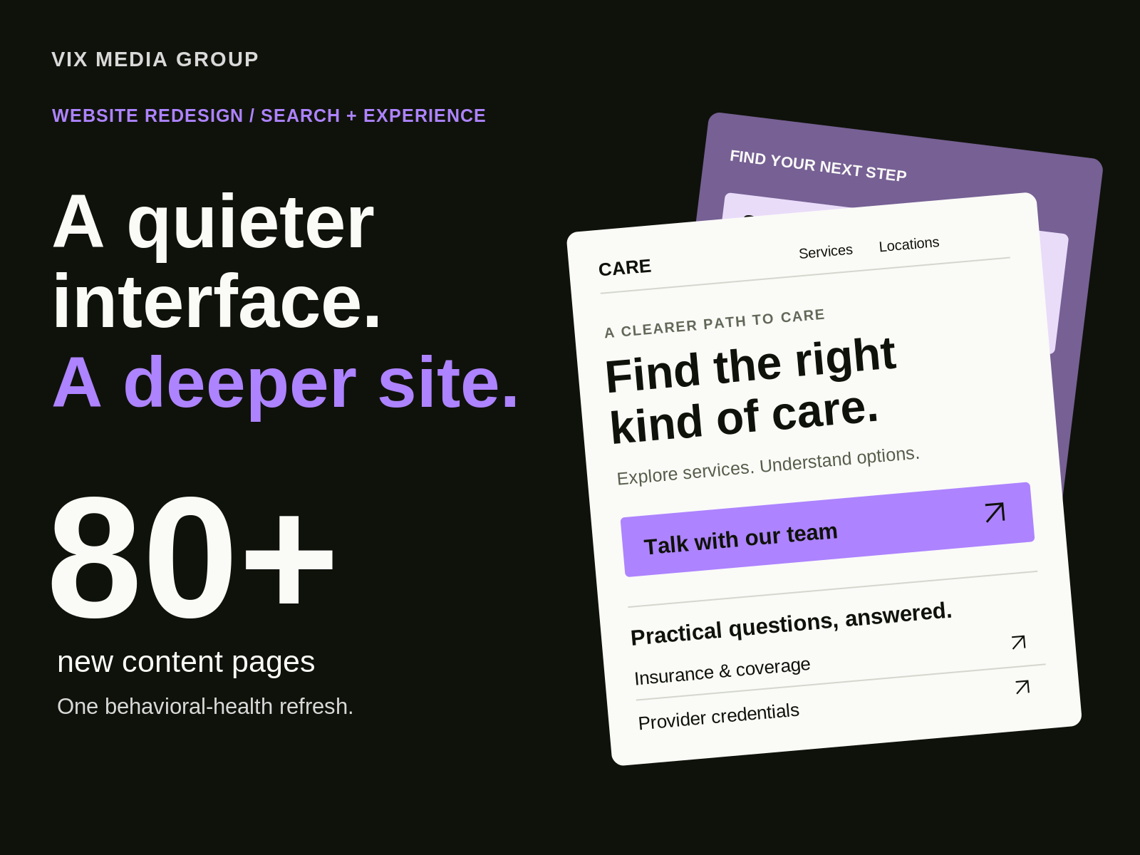
The visible changes were modest. The structural work was not: we added 80-plus content pages across services, locations, conditions, and outcomes evidence. We simplified the navigation and standardized calls to action.
More content. Less navigation friction. That is a more interesting design problem than choosing a new hero image.
At Vix Media Group, I want every redesign to protect what already brings people in and make the next step clearer. Today, that means thinking about Google, AI-assisted discovery, and the person who still has to decide whether to contact the business.
1. Give the redesign a business brief, not just a visual brief.
The behavioral-health project is a useful distinction between a visual refresh and a structural rebuild. They are not the same scope, and the screenshot does not tell the whole story.
Expanding the content library while simplifying navigation addresses two different needs:
- Search visitors need a page that matches a specific question.
- Website visitors need a clear route through the business, not an inventory of every page it publishes.
For a care provider, those questions can start with a condition, a treatment, or a location. Putting all three into one general page makes the visitor do the sorting. Putting every answer in the main menu creates a different problem.
The job is to give useful answers their own destinations, then organize those destinations into a site people can understand. Our SEO strategy and design decisions have to work from the same map.
Does adding more pages improve SEO?
Not by itself. A page earns its place when it answers a distinct need with useful information. A location name swapped into otherwise identical copy is not the same thing as meaningful coverage. The 80-plus pages describe the scope of this project, not a target for every business.
2. Simplify the interface without thinning the information.
A cleaner interface should make the content easier to use, not make the business harder to understand. In the healthcare refresh, simplified navigation sat above an expanded content library. Standardized calls to action provided a more consistent next step.
The live site makes that distinction concrete: visitors can explore services and conditions, check insurance information, and find provider credentials without treating the homepage as the entire website.
This is where good web designers earn their place. A heading identifies the subject. Spacing separates an answer from the next question. A repeated button treatment makes the next action recognizable. The page can be calm without being empty.
One change was more revealing than a new color palette: we corrected a provider’s professional title across key pages and added a credentialed bio to a service page. Accuracy is part of the experience. A beautiful layout cannot compensate for describing the professional incorrectly.
Where should FAQs go?
Put an answer beside the decision it supports. Coverage questions belong near insurance information. A question about the first appointment belongs near the inquiry step. Do not bury every useful answer in an accordion at the bottom just because the template has an FAQ section.

3. Preserve the route from search to the right page.
A redesign starts with an inventory of existing value. Before changing a URL, I want to know what searches reach it, what relevant links point to it, and what visitors do after landing there.
The same logic applies whether the project adds a substantial content library or mainly updates its presentation. Keep a useful address unless there is a good reason to change it. When it must move, map it to the closest relevant replacement, not automatically to the homepage.
My launch checks, which a web developer should be able to walk through with you, follow the visitor’s route:
- Confirm that important pages load and can be indexed.
- Test permanent redirects and update internal links to the final destinations.
- Check canonical URLs, sitemap entries, and production indexing settings.
- Submit a test inquiry and confirm that the team receives it.
- Verify that analytics records the intended action, not just a pageview.
Can a relaunch avoid every traffic dip?
No agency can promise that. Google’s site-move guidance anticipates ranking fluctuations as changed URLs are recrawled and reindexed. A launch needs a baseline and ongoing monitoring, not a promise that the graph will never move.
4. Separate useful demand from impressive-looking traffic.
The number to protect is not always the largest number in the report. A popular news story and a service page that produces inquiries do different jobs.
I have seen this tension in our legal-sector work. A major redesign did not restore the site’s previous traffic level, and a history of high-volume news publishing complicated the picture. A new interface was not, by itself, a recovery strategy.
That experience changes the questions I ask before a refresh. Which page types lost visibility? Which visitors had a reason to hire the business? What changed in publishing, tracking, or search demand around the launch?
The healthcare project’s content expansion and standardized calls to action belong together for exactly this reason. Discovery needs a destination, and that destination needs a useful next step. More pages and more visits are not the finish line.
5. Make room for AI discovery without abandoning the fundamentals.
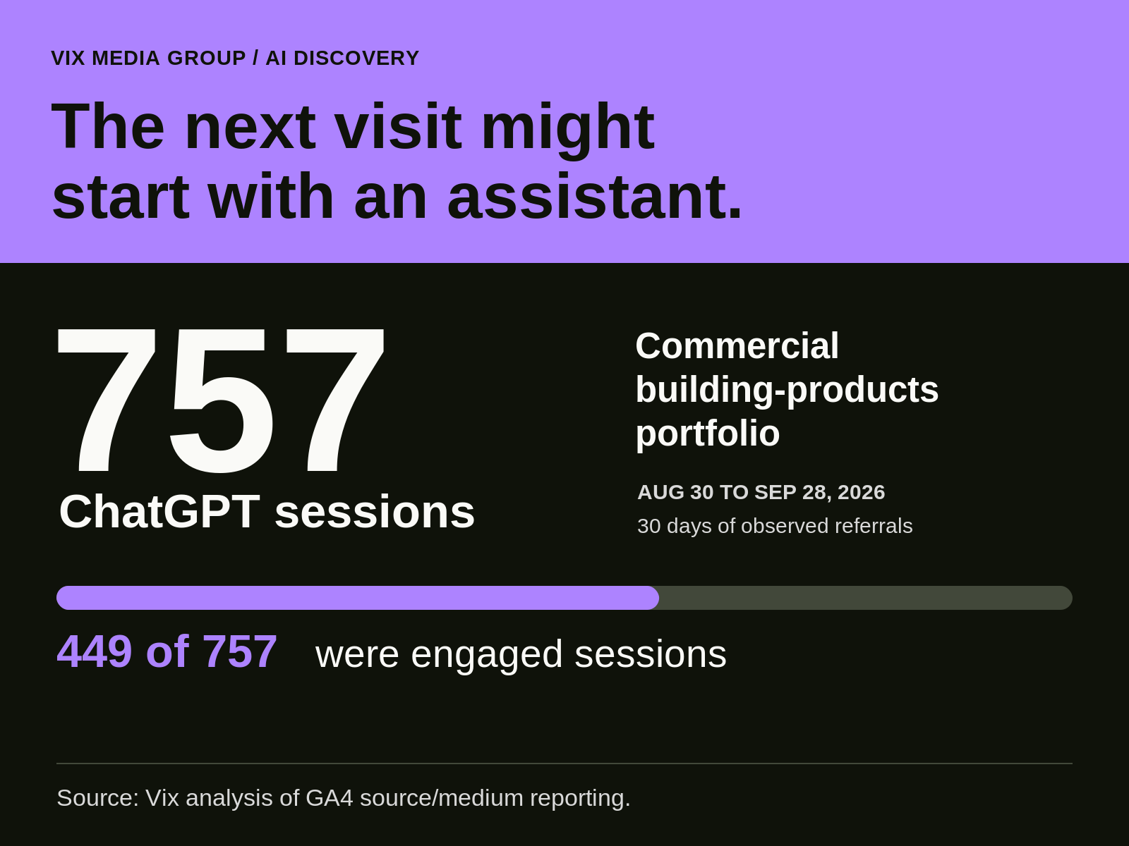
AI assistants are already a measurable entry point into websites we manage. Across a commercial building-products portfolio, we counted 757 sessions attributed to ChatGPT in GA4 reporting from August 30 through September 28, 2026. Of those, 449 were engaged sessions: visits that met GA4’s criteria for time spent, pages viewed, or a key event.
The behavioral-health site recorded 15 sessions from identifiable AI sources in the same 30-day window. That smaller number matters: the opportunity exists, but its scale varies by business.
These are referral observations, not proof that a redesign caused the visits or that every recorded action became a qualified lead. The practical response is to measure the channel and examine what visitors find when they arrive.
Does AI search require a separate kind of website?
My starting point is a site that explains the business exceptionally well. Clear services, accurate credentials, useful answers, connected pages, and accessible content help the reader regardless of the source of the visit.
For Google’s own AI features, Google says the existing SEO fundamentals still apply. That is not a universal recipe for every assistant. It is a useful correction to the idea that AI discovery requires abandoning the fundamentals that make a website useful.
6. Judge the relaunch by the journey it supports
After launch, put search visibility, landing-page traffic, and verified inquiries beside one another. Break them down by source and page purpose. That is why I see website development as more than getting pages live: the inquiry still has to reach the right team.
For the behavioral-health refresh, the story is not a dramatic aesthetic reinvention. It is an expanded content library, simpler navigation, clearer professional information, and a more consistent path to contact. Those decisions shape how the site works long after the homepage reveal.
A redesign should make the business easier to understand and easier to reach. The best proof is not how different the homepage looks.
Before your next relaunch, can you trace a real customer question from the search result to the right answer and a working next step?
Find more Community stories on our blog Courtside. Have a suggestion? Contact stories@dribbble.com.


