

About the Author:
Vicente Reyes Montealegre, heads Afternow’s Brand and Web teams to guide SaaS companies, enterprises, and fast-growing startups in their digital journeys. The agency’s work spans strategy, brand, website, product and development, all under one roof, all connected to one vision.
Access to care was the whole point of Kinetik’s business. Non-emergency medical transport gets patients to dialysis, to chemo, to appointments they’d otherwise skip. So, the actual brief for this patient coordination platform design ran much deeper than logos and layouts. We needed to build a comprehensive product people could trust their care to.
The American healthcare system doesn’t make that simple. Riders, providers, and insurers all operate on different timelines and different systems, and getting them to coordinate can be exhausting for everyone involved, patients included. Kinetik exists to make that coordination actually work.
That’s a different problem than what most HealthTech faces. Kinetik’s users weren’t optimizing a workflow. Many were older, managing a condition, coordinating a ride they couldn’t afford to miss. Every decision, on the brand, the site, the products, had to hold up under that weight.
Warmth as a design compass in healthcare branding
We moved away from the clinical, high-tech blue and aqua gradients the old identity relied on. Most health tech platforms reach for a look that leans too much on the tech and not so much on what health means. It’s a common pitfall you’ll notice when browsing portfolios of even highly rated brand identity designers.
It makes sense because that is where innovation sat ten years ago. Today, we can argue that audiences are craving for digital experiences that feel tangible, genuine, with more texture and life in them.
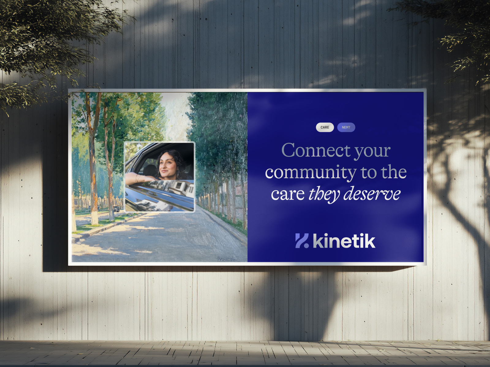
The inspiration point started with a very concrete moment of Kinetik’s users journey: the feeling of looking out a window on a ride, watching the city go by as they travel to their medical appointments. That image is where the painterly, almost impressionistic illustrations of the urban landscape came from.
The palette followed the same instinct, pulled from the organic rather than the artificial: deep and vivid greens against gold, salmon, lavender, and a purple that reads like the last light of a sunset. Nothing else in the category looks like this.
Typography carries a similar weight. An elegant serif, used large, gives the brand a voice instead of blending into the next healthcare login screen. Used small, it steps back and lets the content do the work.
The photography direction stays close to that same idea, people in ordinary moments, at home, in the city, living their lives. Access to care isn’t confined to a hospital visit, it shows up in every part of someone’s day.
The refreshed logo carries this story as well. A capital K, drawn in one curved stroke, with a dot sitting at the end like a destination marker, because getting somewhere is what Kinetik actually does.
Structuring medical website navigation for complex audiences
The marketing site had one real problem before the rebrand: articles, case studies, and news all sat in one undifferentiated pile. We split it apart, and built the site’s structure and navigation around the three groups Kinetik actually serves: health plans, transportation providers, and state and government agencies, each with a clear path through the site instead of one menu trying to work for everyone.
The website does more than tell the story here. The same visual language that sets the mood on the landing page also gets used inside the product screen visualisations, to flag a trip, a claim waiting on review, or a step someone shouldn’t skip. Same system, pulling double duty: telling the story, and pointing at what matters.
HealthTech products solving opposite users at once
Inside the products, the same question got harder. Coordinators needed dense, fast interfaces, real-time visibility across thousands of trips, quick assignment, no wasted motion. Patients using the Kinetik Health app needed almost the reverse: large touch targets, few steps, a calm interface that doesn’t rush them.
That tension sits at the center of the patient app. Real-time tracking and recurring scheduling are genuinely sophisticated features. They had to live inside something simple enough for someone managing a visual or cognitive impairment to use without a second thought.
Contrast, focus states, type size, motion, none of it was a checklist item added at the end. It shaped the product from the start, proving exactly why companies must look beyond aesthetics when vetting UI/UX designers. Confusion on this screen costs someone their ride to treatment.
What it takes to build a healthcare product patients can rely on
The brand is the part people notice first, the color palette, the painterly illustrations, the typographic voice. It’s the part that makes Kinetik stand out on a shelf full of competitors that forgot about the people they’ll be affecting the most. That matters. But a harder, quieter work sits underneath: the architecture, the user flows, the structure that holds four different products together for four very different users. That work is the proof point, and the reason a patient with a ride booked for 7am can actually get there.

Find more Community stories on our blog Courtside. Have a suggestion? Contact stories@dribbble.com.


