


About the Author:
Klym Yevtushenko is the Founder & CEO of VibeStyle. He works with startups and growing companies to turn ideas into clear, engaging digital experiences: from high-converting websites, landing pages and mobile apps to SaaS platforms and digital products.
When we worked on a B2B website redesign site for NestiFi, we put family finance ahead of the banks and credit unions who were paying for the platform.
This is because before we touch layout on any redesign, we figure out who’s deciding and what order they need information in.
I’ll walk you through what that process looks like and how we start every website redesign project that delivers results.

How We Approached NestiFi’s B2B Website Redesign
NestiFi is a family finance platform. Credit unions, community banks, and wealth firms use it to offer branded financial experiences to their own customers, from family investing and teen money to financial planning, education, and AI-powered guidance.
That means the FinTech platform had two audiences with very different questions. These are the institutions that buy, and families that use it.
Founder and CEO Niall Dennehy shared with us the moment his mother took him to a credit union in Cork to open his first account. Years later, he’s asking what a child’s first meaningful financial experience should look like today.

This story reflects the human purpose behind NestiFi, which is helping families build better financial relationships. And for us, the challenge was translating that vision into a B2B website.
The scope covered website strategy and information architecture, UX/UI and responsive design, brand identity and visual direction, product positioning, and the Webflow design itself.
The website had to address both perspectives without becoming overly technical or looking like a purely consumer-focused finance app.
If you’re faced with a similar challenge, here’s what we recommend you evaluate before designing:

1. Your audience’s decision-making process
Our designer suggested a simple exercise. That is to pretend we’re bank executives seeing NestiFi for the first time.
Instead of discussing colors and layouts, we started asking different questions: Would we understand the business value? Would we trust the platform? Would we know what to do next?
This helped us look beyond visual design and evaluate the website from a potential buyer’s perspective.
We also wrote down what each of NestiFi’s audiences needed to know.
- Institutions needed to understand the business value, how it fit into their existing offering, the functionality, how reliable it was, and what it could integrate with.
- Families needed to know how it would change the way they manage and understand money together.
2. Your homepage information hierarchy
In an early design review, we realized we were trying to explain almost everything on NestiFi’s homepage: family investing, financial education, AI features, institutional benefits. Someone on our team even joked we were fitting the entire product presentation onto one screen!
We simplified the homepage and spread the information across the journey, so visitors could discover the product step by step.
3. Your website user journey
We organized NestiFi’s site as:
Family finance → Value for families → Value for institutions → Product capabilities → Trust and implementation → Demo.
This structure was also what let us connect the emotional purpose behind NestiFi with the practical information institutional buyers actually need, rather than treating those as two competing stories.
A clearer value proposition, better hierarchy, and more visible calls to action all contributed to demo-request conversion rising 38%, and average engagement time to 31%.
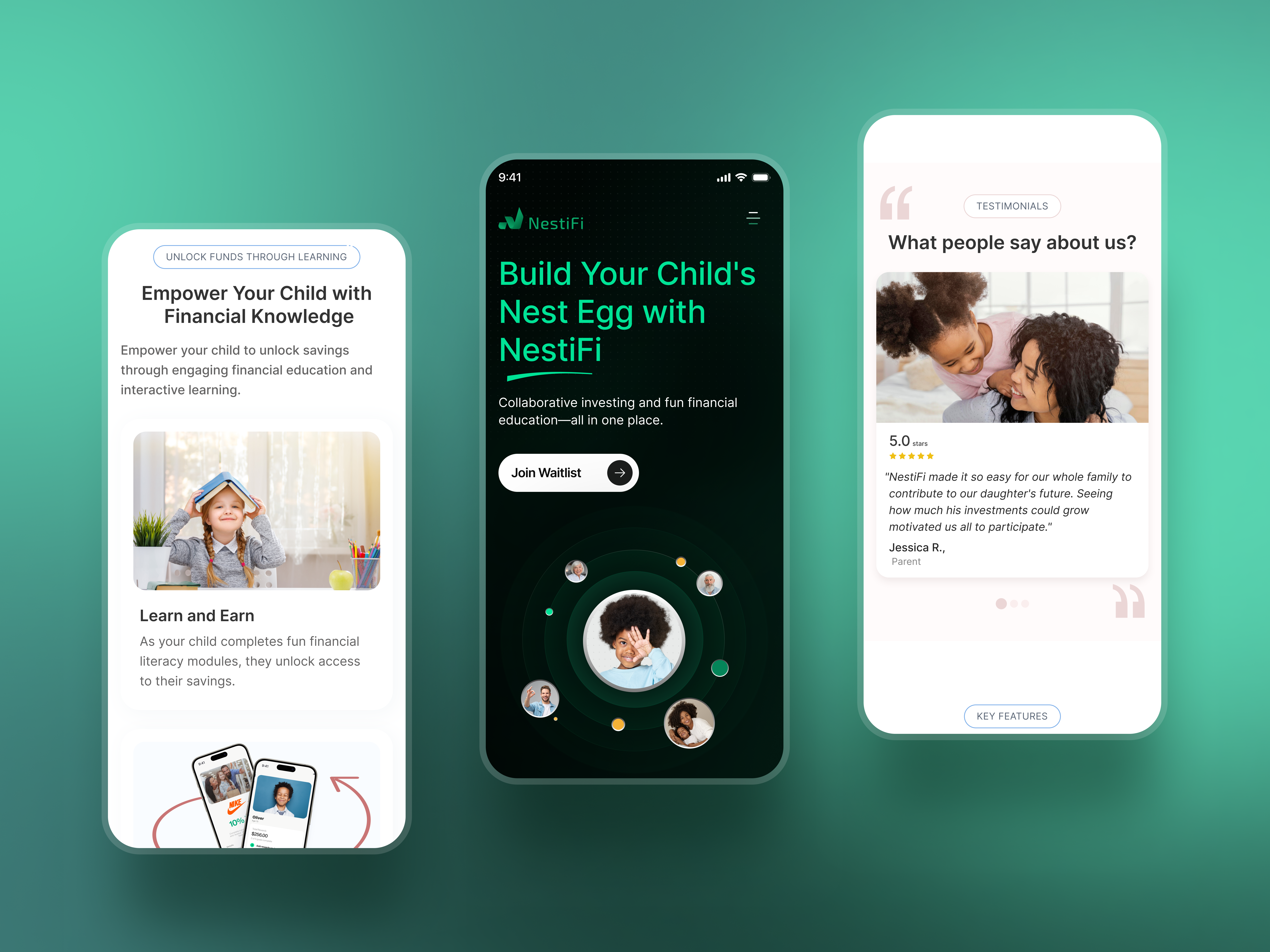
4. Your mobile UX and platform
Responsive design and simplified mobile navigation cut NestiFi’s mobile bounce rate by 24%.
We built NestiFi in Webflow, giving it a flexible foundation for future capabilities, including new integrations, without overcrowding the homepage.
Key takeaways for your next B2B website redesign
The biggest lesson from NestiFi, for me: web designers should start with the audience and how it makes decisions, not with visual improvements.
Beyond the numbers, the real win was giving NestiFi a clearer way to talk about a genuinely complex business model. Have one story that institutions and families could each find themselves in.
Find more Community stories on our blog Courtside. Have a suggestion? Contact stories@dribbble.com.


