About the Author:
Vicente Reyes Montealegre, heads Afternow’s Brand and Web teams to guide SaaS companies, enterprises, and fast-growing startups in their digital journeys. The agency’s work spans strategy, brand, website, product and development, all under one roof, all connected to one vision.
A big part of our story as an agency runs through this community. Dribbble is where Balkan Brothers / BB Agency, the agency Afternow used to be, first found an audience beyond Krk. So, it felt like the right place to get into the in-house details of our company rebranding.
We’re five months into rebranding our agency, and we’ve talked a lot about it. Our new positioning, the strategic and business decisions that drove the change, how we’re operating moving forward.
What we haven’t touched much on is the visual identity itself, the pure graphic design bit, and how a project like this brought our design teams together like never before.
We’re sharing part of the process here for the same reason we’d want to see it from another studio, a look at what it actually takes to give our brand the same care we give client work.
Lesson 1: Build an identity that grows with you
Our old identity was built for a smaller, more local version of the agency. It worked when we were a small studio taking briefs from startups mostly looking to revamp a website. It stopped working soon after we became a proper agency: fifty-plus people working with enterprise tech companies across strategy, design and technology. That shift had happened years before the identity caught up, and small refreshes along the way weren’t enough to close the gap. The relationship we were trying to build as strategic partners kept meeting clients through a visual language that still read as a small studio taking on freelance work.
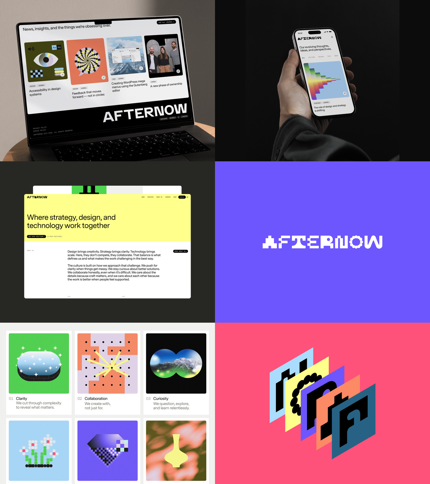
With little room to move, our old typeface, palette and overall look applied the same way whether we were pitching to a Series C company or posting on Instagram. Nothing wrong with consistency, but consistency without range started to look like a lack of imagination, which doesn’t play well for a design agency.
So the brief was clear: build an identity with real range, tight enough to signal the maturity of our services and audience, loose enough to keep experimenting and push our creative work forward. Something that could hold both ends without snapping in the middle.

Afternow: from conceptual to systemic thinking
The name itself gave us the logic before we’d drawn a single shape. Afternow sits between two ideas: grounded in the now, shaping the after. Rooted in the complexity and constraints of the present, and ready for whatever comes after it, our new name carries a built-in instruction: keep evolving. Once we saw the identity needed to hold both at once, the concept stopped being just a name and became structural. Fixed and flexible by design.
The system splits into two registers.
- Fixed: the custom wordmark, the Messina family as primary typeface, the hierarchy, the layout grid, a greyscale palette. These carry the weight of credibility, the parts of the identity that show up in a proposal, a case study, a client deck, anywhere we need the work to speak for itself without visual noise competing for attention. The rules are applied consistently across all our material, and their simplicity serves as the skeleton that holds everything together.
- Flexible: the expressive secondary color palette, our “digital surrealism” illustration style, and a set of alternating glyphs that swap into the wordmark and across the system. This is where the personality lives, what lets us look different on social media than we do in a pitch document without ever becoming unrecognisable. These are also the elements most likely to evolve. The glyphs we use to transform the Afternow logo today might not be the ones we use next year. The essence of the brand doesn’t lie in the shapes or colors themselves, but in the fact that they can always change.

The two registers work because the fixed side never bends and the flexible side never breaks the frame. An identity that only had structure would make us rigid within months. One that only had expression would tip us into chaos. Afternow needed both, because the agency runs on the same combination: strategic rigour on one side, creative range on the other.
Lesson 2: Your website redesign is more of a content exercise
In our line of work, a website is where an identity either proves itself or falls apart, because it has to carry the full weight of what we do, beyond how we look. Ours needed to hold five service lines: strategy, brand, website, product and development, each legible on its own while still reading as one connected practice.
The previous site carried its own version of the identity problem. In trying to make sure clients got the fullest picture of us, it piled on subpages, diagrams and explanations until the volume itself started signalling the opposite of confidence. We don’t need to explain everything to be understood, and we don’t need to keep proving our worth on every page.
Fixing that was as much a content exercise as a design one. We went back through the site and separated what actually earned attention on a page, the elements that were engaging and pushed toward an inquiry, from what belonged somewhere else entirely: long form content, pitch decks, onboarding conversations. Giving each its own place gave the site clarity and room to breathe. Clarity reads as confidence, and confidence is what builds trust.
Case studies were another hard part to get right. We work across a lot of client touchpoints on a single engagement, and the temptation is to show everything. Instead, the editorial and layout system does the sorting for us: a fixed structure for how a case study opens and closes, flexible modules for how the work itself gets shown. A brand-only project and a four-product partnership can both live in the same format without either one feeling padded or squeezed.
Lesson 3: Bring your brand system to life
None of this works as a set of static rules. What makes the system feel like a living identity, rather than a style guide people follow loosely, is motion.
The wordmark, the call to action buttons and a handful of graphic elements share a morphing behaviour, so the same shape logic that defines the identity at rest is still present the moment something moves. And every animation on the site follows the same ease in and ease out rules, so pace and rhythm stay consistent whether it’s a hero section loading or a button responding to a hover. It’s a small thing, but it’s the difference between elements that happen to share a page and elements that feel like they’re breathing together.
We also built an echo effect that runs through transitions across our video reel, website navigation and footer: as one visual gives way to the next, a trailing shape holds the connection between them for a beat before it disappears. This subtle detail added the missing element of awe and surprise to pages that otherwise felt stale.
Motion is often the last thing added to an identity system. For us, it’s what brought the whole system to life.
Lesson 4: Trust your rebranding vision and the team behind it
None of the above happened in one room, or from one discipline. From strategy to execution, it involved almost everyone in the agency at some point. For the areas covered here, Irene Sempere led the strategy work that gave the team its alignment and foundation. Eliana Martinez and I worked the visual identity together, testing how far the fixed and flexible sides could stretch before either one broke. Wesley van’t Hart and Barbora Walia Kratochvil took that system and built it into a website that had to work as hard as it looks. Aleksa Bukvic built the motion language from scratch and made sure it held everything else together. Giannis Koulouris brought all of it to life in code, its own kind of design decision, made under constraints the rest of us don’t always see.
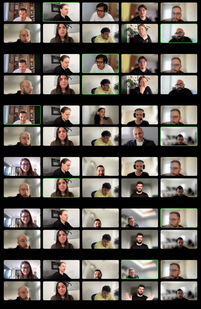
Alongside Filip Justic, I’ve led a lot of the thinking behind this identity, but none of it would hold up without the talented group of people we work with. That’s the part I most wanted this piece to get across. A rebrand this size only works when trust runs in every direction, when strategists trust designers to translate the thinking, when designers trust developers to protect the details, and when everyone trusts the brief enough to push back on it. This one did, and it shows.
Find more Community stories on our blog Courtside. Have a suggestion? Contact stories@dribbble.com.