About the Author:
Paul Lilley, Ulysses Founder / Creative Director, cut his teeth in London and Melbourne working for creative and art agencies including Vice, Cornerstone, and Next Wave. His collaborations with international clients on large scale campaigns gave him deep grounding in strategy, positioning and brand identity design, which he now brings directly to food and beverage founders building their brands.
To be a restaurant owner in the foodie borough that is Brooklyn, NY, you should be ready to compete not just on the quality of your food, but also on experience, atmosphere, service, social media, and branding. Ultimately, these touchpoints decide whether somebody remembers your restaurant when they’re deciding where to go on Friday night.
That was the challenge we faced when we were approached to create the brand for Lucky Parlor, a new gyoza and cocktail bar in Brooklyn.
The owner, Tatsumi, found us through Dribbble.
He’d seen our profile and examples of how we’d helped other food and beverage businesses build distinctive brands in similarly crowded markets, and our approach resonated with what he wanted to create.
This wasn’t Tatsumi’s first restaurant. The team already operated two Japanese food concepts in Brooklyn and had built a local reputation around high-quality, more traditional Japanese sushi and udon. But this time they wanted to push the boat out a little further.
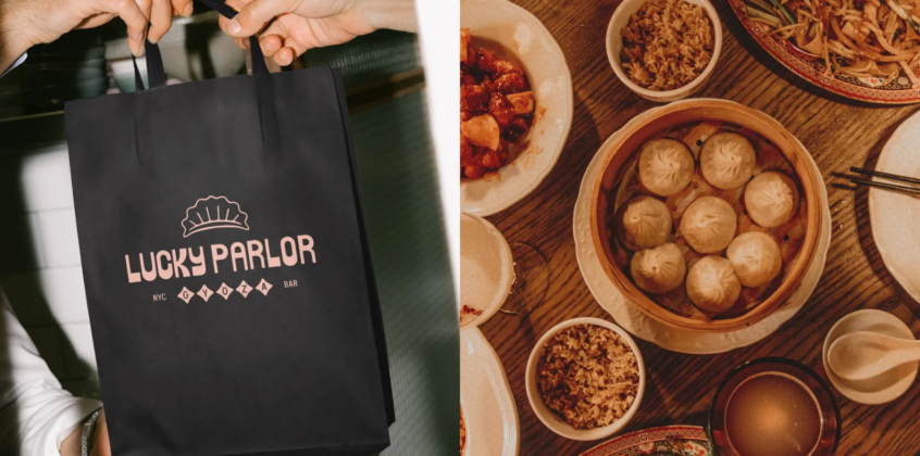
Lucky Parlor wasn’t supposed to be just another place to eat gyoza. The vision was a neighborhood hangout: somewhere you could drop into any night of the week with friends, family, or by yourself. The menu would combine creative, small-plate Japanese food with equally interesting contemporary cocktails, all served in an environment that felt relaxed but still elevated.
Our job was to make the brand feel as interesting as the concept. We didn’t need to create another nice-looking restaurant. We needed to make it unmistakably Lucky Parlor.
Building a brand before a logo.
The initial request was branding. And from the get-go, we knew it wasn’t just a logo. This is an important distinction because one of the biggest mistakes I see businesses—and sometimes designers—make is treating the logo as the brand.
A logo is an identifier. It’s one piece of a much larger system. Lucky Parlor needed a flexible brand capable of growing with the business.
Our scope began with brand strategy, followed by the identity: logo, typography, color, illustration, brand assets, collateral, and a website as the brand’s digital home. Our pitch was simple: don’t invest in a logo; invest in a brand that’s built to scale.

A restaurant needs to show up in dozens of places: menus, signage, packaging, social media, merchandise, events, digital touchpoints, and applications nobody can predict on day one. If the entire identity depends on putting the logo in the corner, you haven’t really built a brand system. You’ve built a logo and a collection of layouts.
We wanted to give Lucky Parlor a recognizable visual language its audience could connect with across all of those touchpoints. The test for us was simple: if you removed the logo, would somebody still recognize the brand?

Letting strategy drive every design decision.
Before we drew anything, we defined what Lucky Parlor needed to become. Our project goal was to position it as a friendly and innovative gyoza bar serving some of the best Japanese food and contemporary cocktails in the game.
The concept sat somewhere between a gyoza bar, a cocktail bar, and a tapas-style dining experience. The owners wanted to create a place that brought people together around a shared love of handcrafted gyoza, creative small plates, and modern interpretations of familiar cocktails.
That gave us some useful tensions to work with: friendly, but elevated. Playful, but premium. Creative, but not chaotic. Innovative, but still accessible.
Those tensions became much more useful than a collection of visual references.

This is why I believe strategy should come before aesthetics. Strategy doesn’t restrict creativity; it gives creativity a problem worth solving. Without strategy, the conversation becomes, “Do we like this font?” With strategy, it becomes, “Does this font help us feel playful but premium?”
That’s a much better conversation.
The same applies to every design decision. Instead of asking whether something simply looks cool, we can ask whether it moves the brand closer to the position we’re trying to own. Our filter throughout the project became incredibly simple: Does this feel like Lucky Parlor?

Exploring the right amount of spice.
Once the strategy was established, we moved into creative exploration. Our approach is highly collaborative. We don’t believe the best way to get to a strong solution is to disappear for a few weeks, come back with one polished direction, and announce, “Here it is.”
Instead, we explore a spectrum. Internally, we call it mild, medium, and spicy.
Mild gives the client a relatively safe interpretation of the strategy. Medium pushes things further. Spicy asks what happens if we really lean into the personality and see how far the idea can go. Importantly, these aren’t three random logos. They’re three interpretations of the same strategic foundation.
For Lucky Parlor, our first direction was more minimal and hand-drawn, taking inspiration from the visual character of a Japanese postcard. It was charming and considered, but deliberately restrained.
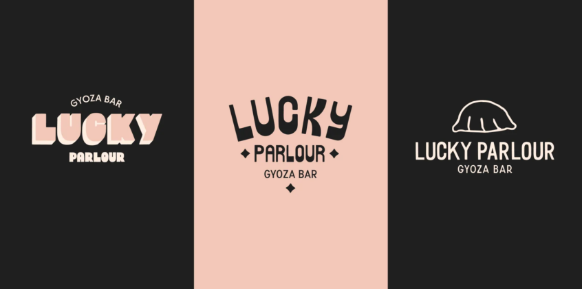
The second direction became bolder. We explored bold typography with a drop shadow, inspired by vintage signwriting and old Brooklyn storefronts. It had more physical presence and brought some of the neighborhood energy into the identity.
The third pushed the personality furthest. We explored playful, nostalgic-inspired lettering and reinterpreted it through a contemporary lens. It felt friendly, energetic, and recognizable without losing the elevated quality we wanted. That became the foundation for the final identity.
But presenting the work wasn’t a matter of, “Here are three options. Pick one.” A client might respond to the energy of one direction, the typography of another, or a detail from the third. Our job is to understand why they’re responding to those things and use that information to refine the brand.
We’re not asking the client to become the designer. We’re using their reactions as data.
Creating a world around one gyoza mark.
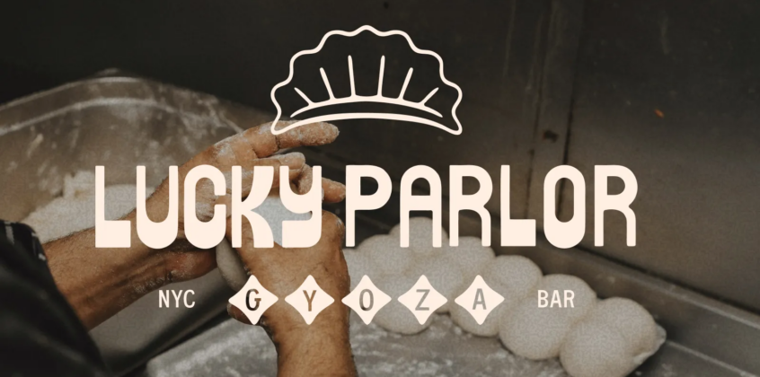
The centerpiece of the identity became a simple gyoza brand mark. Rather than plastering it over everything, it became a recurring shape and visual device throughout the system. It could function as a recognizable mark, a frame, a graphic device, or a small detail that tied an application back to the wider brand.
That repetition matters. A distinctive brand isn’t created by inventing something new every time you design an application. It’s created by identifying a small number of recognizable ingredients and using them consistently enough that people start associating those ingredients with you.

We paired the core identity with an extended palette of vibrant but slightly muted colors, while black became a consistent grounding element. It allowed the identity to be colorful without becoming childish and playful without losing its premium edge.
Another major part of the system was illustration. We created a suite of hand-drawn illustrations covering everything from gyoza and cocktails to illustrations inspired by the founder’s daughters. The style was deliberately naive, loose, and imperfect.

Those subtle imperfections were important. In branding, perfection isn’t always the answer. Sometimes making everything perfectly geometric, perfectly aligned, and perfectly consistent strips out the thing people would have connected with.
The hand-drawn quality gave Lucky Parlor warmth and provided another ownable ingredient that could stretch across collateral, merchandise, digital applications, and future communications.
This is something we prioritize in our work. Custom typography, illustration, lettering, textures, and graphic devices add a human touch that creates a brand capable of standing out in a crowded market.
Designing for what we couldn’t predict.
The brand will eventually appear somewhere you didn’t anticipate. Somebody will need a poster tomorrow. A new menu will launch. There will be merchandise, an event, a collaboration, a social post, a new location, or some other application that wasn’t in the original scope.
You can’t design all of those things in advance. What you can design is a system capable of handling them.
For Lucky Parlor, the gyoza mark, typography, color palette, illustrations, textures, and graphic language became a box of ingredients. Those ingredients could be combined differently depending on the application without losing the thread of the brand.
This is where I think designers need to rethink what consistency means. Consistency doesn’t mean making everything look the same. It means making everything feel like it came from the same place.

If every piece of communication is identical, the brand becomes boring. If every piece is completely different, the brand becomes forgettable. The opportunity lives somewhere in the middle.
When we’re building identities, I’m interested in creating what I think of as memory hooks: a small number of distinctive elements customers can begin associating with the business. For Lucky Parlor, the gyoza mark is one. The lettering is another. The illustration style, color palette, and overall playfulness create others.
Individually, none of those elements has to carry the entire identity. Together, they create recognition. The first time someone sees the brand, they notice it. The next time, it feels familiar. Eventually, they recognize Lucky Parlor before they’ve consciously processed the name.
That’s when design starts becoming brand equity.
Giving Lucky Parlor a sense of self.
Lucky Parlor was a business concept with a clear vision but without a visual identity capable of expressing it. Afterward, it had a sense of self.
The brand became friendly, recognizable, playful, and distinctive. More importantly, the founders had a visual system they could continue using as the restaurant grew.
That, to me, is the real deliverable of a branding project. Yes, we delivered logos, typography, colors, illustrations, collateral, and all of the tangible assets you’d expect. But the more important result was clarity. The business knew how it should show up, what it should feel like, and had the tools to communicate that consistently.
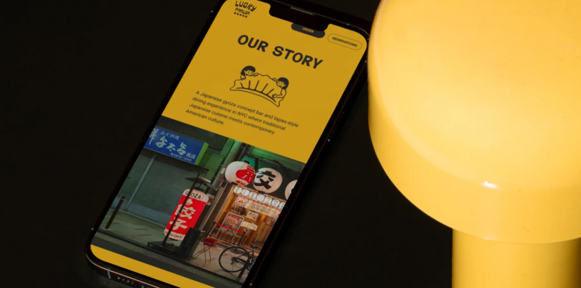
We didn’t just create another gyoza restaurant. We created Lucky Parlor.
That’s the difference I want branding to make.
Giving people a reason to remember.
My biggest advice to designers and agencies hoping to win projects like Lucky Parlor is to stop leading with deliverables.
Clients can find thousands of people capable of designing a nice logo. What they have a much harder time finding is somebody who can understand why their business is struggling to differentiate itself and translate that problem into a brand people remember.
Ask them the following:
- Who they’re competing against
- What customers should remember about them
- What conventions dominate their category
- Where they want to fit in and where they deliberately want to break away
- What they want people saying about the business when they’re not in the room
Then design.
And when you present the work, don’t just explain what you made. Explain why. “We used hand-drawn illustrations because they look cool” is an aesthetic explanation. “We used hand-drawn illustrations because the imperfection gives the brand the warmth and approachability required by the positioning” is a strategic explanation.
Same illustration. Very different conversation. The first positions you as someone who makes things look good. The second positions you as someone who can solve business problems through design.
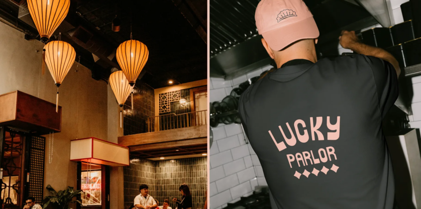
Lastly, for brands facing the same challenge as Lucky Parlor, I’d pay close attention to the questions designers and agencies ask before they talk about aesthetics.
A good branding partner should want to understand your business, audience, competitive environment, personality, ambitions, and the space you can realistically own.
They should also be willing to push you. The objective isn’t to hire somebody who agrees with everything you say. It’s to find someone who can take what you know about your business, combine it with an outsider perspective, and identify opportunities you might not see from inside the company.
Because ultimately, branding isn’t about having the prettiest logo in your category.
It’s about giving people a reason to notice you, a reason to remember you, and a reason to choose you.
And in a crowded market, that might be the most valuable thing a brand can own.
If you resonate with this article or would like to hear what Ulysses Design Co can do for your brand, you can drop me a line here.
Find more Community stories on our blog Courtside. Have a suggestion? Contact stories@dribbble.com.