


About this Service
A custom UI kit creation service – we design a library of UI components and elements specific to your product or brand, without full documentation overhead.
Style definition: we’ll define the core UI style based on your brand (colors, typography, basic spacing guidelines) to apply across components
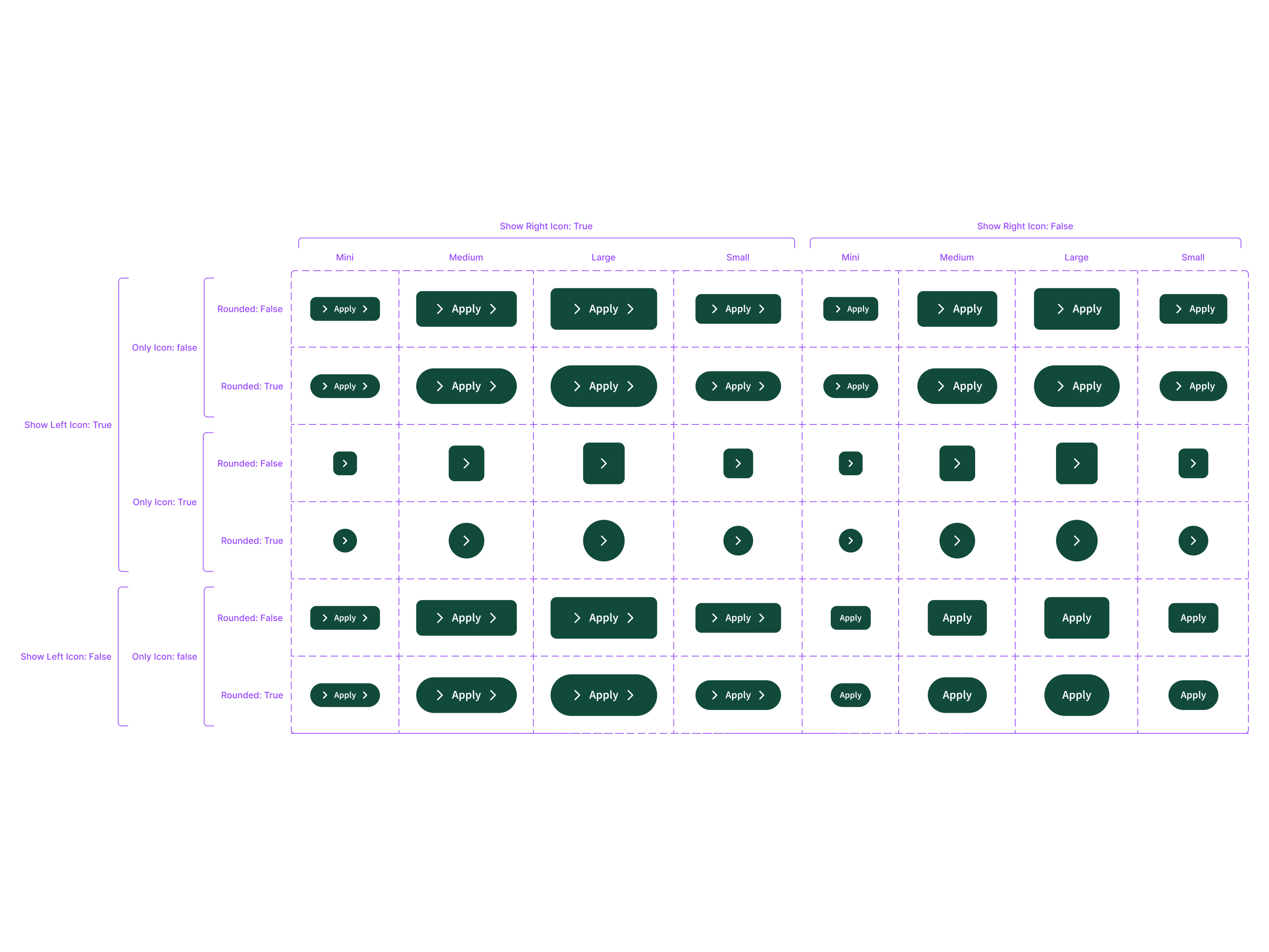
Custom component set: design of ~20–30 common components in your style – e.g. buttons (all sizes/states), form fields, nav bars, headers/footers, cards, modals, etc.
Figma library setup: all components built as symbols/variants in Figma for easy drag-and-drop use in new designs
Iconography: inclusion of a small icon set (from a consistent library) for use in UI, styled to match (up to ~20 icons)
Usage notes: a short reference sheet (1–2 pages) on how to apply the components and any specifics (for example, padding standards, grid layout suggestions)
2 revision rounds to refine component styles or add any missing key component based on feedback
This is great for teams who need a set of reusable UI building blocks (buttons, icons, cards, etc.) to speed up design and development, but don’t require a complete design system engagement. The UI kit ensures any future pages or screens maintain a consistent look and feel.


