


About this Service
We build a scalable design system for your product from the ground up. This service codifies your UI components, styles, and guidelines into a single unit – streamlining design-dev collaboration and ensuring consistency across your app or website.
UI inventory & audit of your existing screens/components to identify patterns and inconsistencies
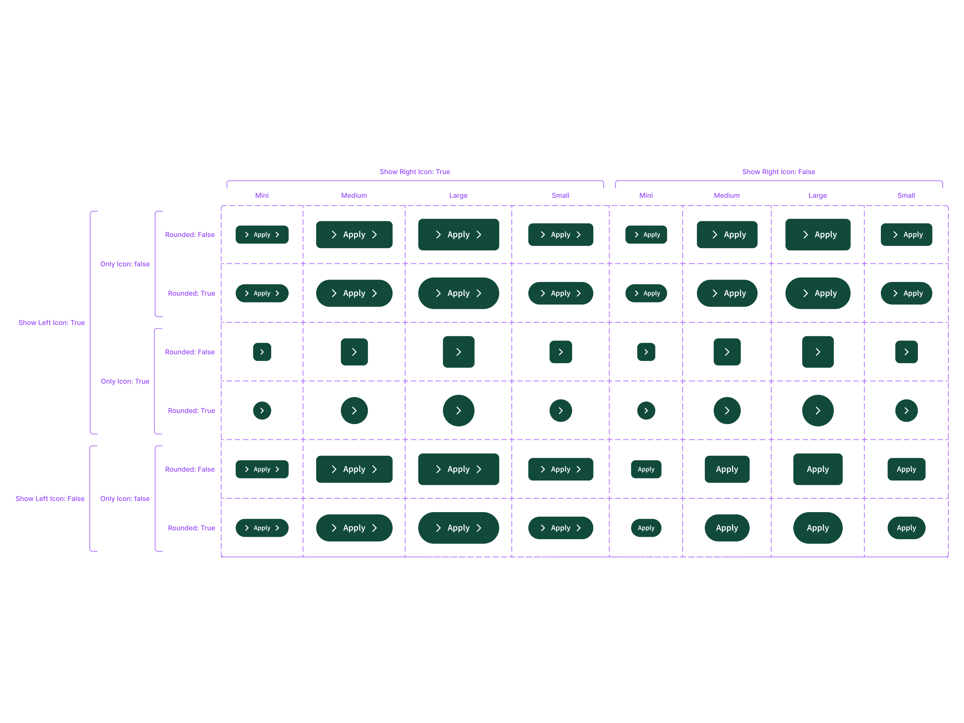
Figma component library creation: buttons, forms, modals, icons, etc. built with variants and Auto Layout for flexibility
Design tokens & styles setup: color palette, typography scales, spacing, shadows defined globally for reuse
Interaction states for components (e.g. hover, active, disabled states for buttons) and responsive behaviors guidelines
Documentation: a written guide (in Figma) explaining how to use each component, dos and don’ts, and overall design principles
Handoff workshop: a live walkthrough or Loom record for your team to explain the system and ensure smooth adoption
Best for growing startups or products with design debt looking to unify their UI. The end result: a Figma library of reusable components and a reference guide that empowers your team to move faster and more cohesively.


