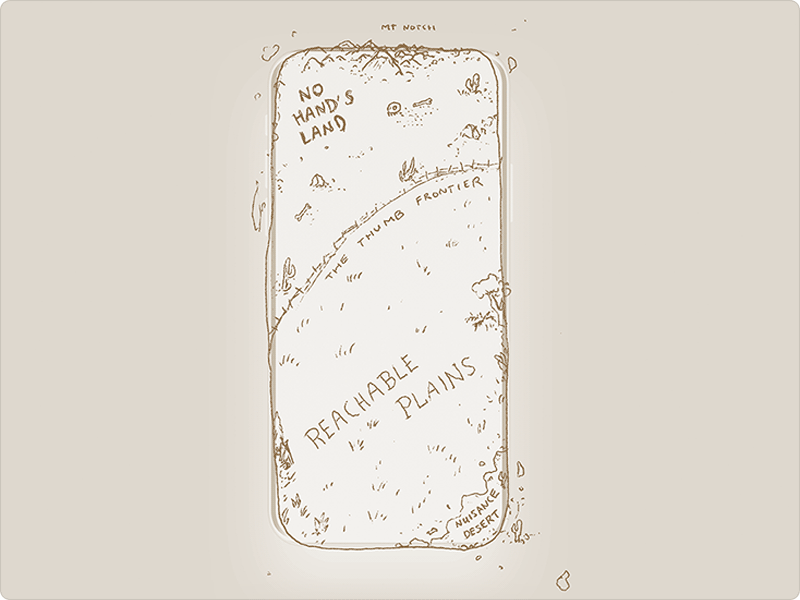
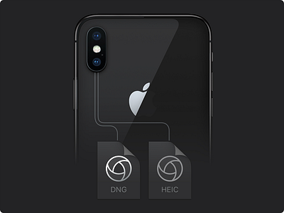
A map I drew to illustrate how we designed Halide 1.5 for iPhone X. We ensured every bit of the UI is reachable, not ending up in the dreaded No Hand's Land.
Read the post here!
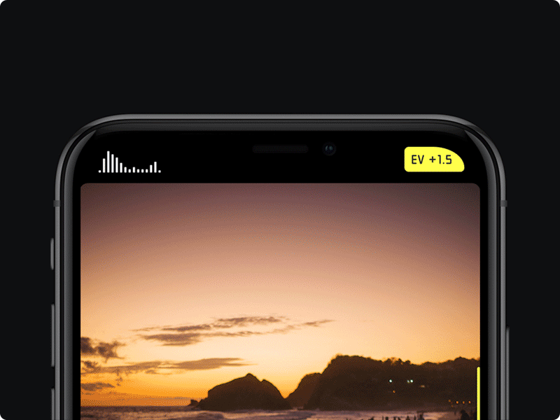
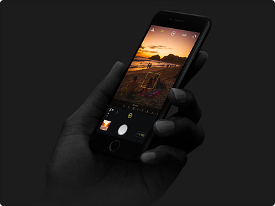
How we use the 'horns' on iPhone X and embrace the notch on Halide 1.5 - our camera app designed from scratch for iPhone X.
This typeface is completely custom, by the way. We call it "Halide Router".
A slight adjustment and evolution for the app icon of Halide for its big 1.5 update. We adjusted texture, lighting, and also changed the color so it looks great on black backgrounds, blurred dock backgrounds on black backgrounds and OLED...
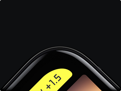
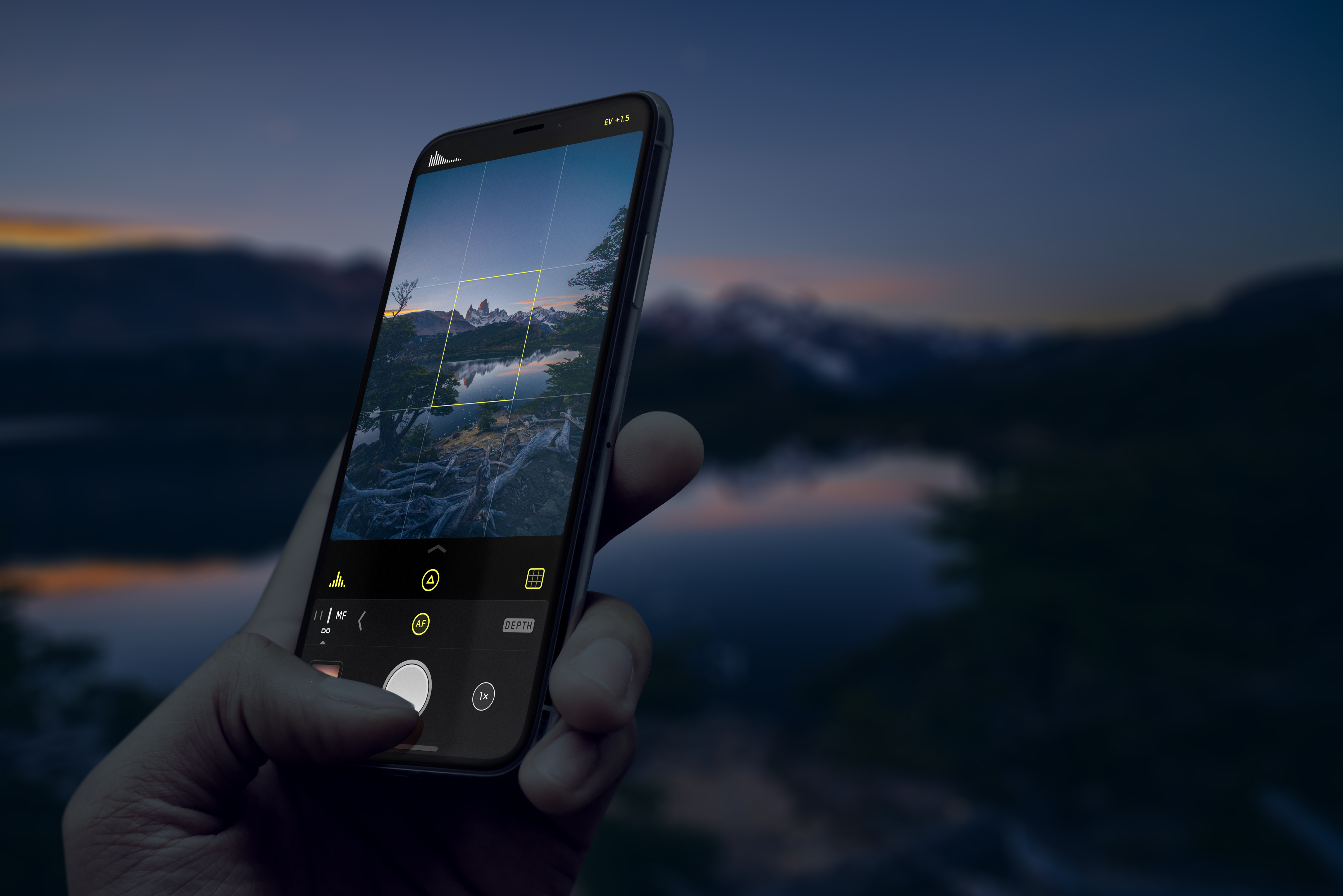
Eek, the Notch. When we set off to redesign Halide for iPhone X, we had to do something with the notch. Insetting the viewfinder would be bad; you'd lose visual area of what you are photographing.
Initially we had controls up there but...
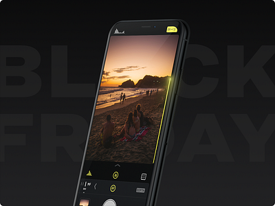
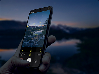
I'm extremely proud and excited to show off our app update for iPhone X: Halide 1.5.
We spent a ton of work basically redesigning it from the ground up for iPhone X.
When we saw the iPhone X for the first time and adapted our UI for ...