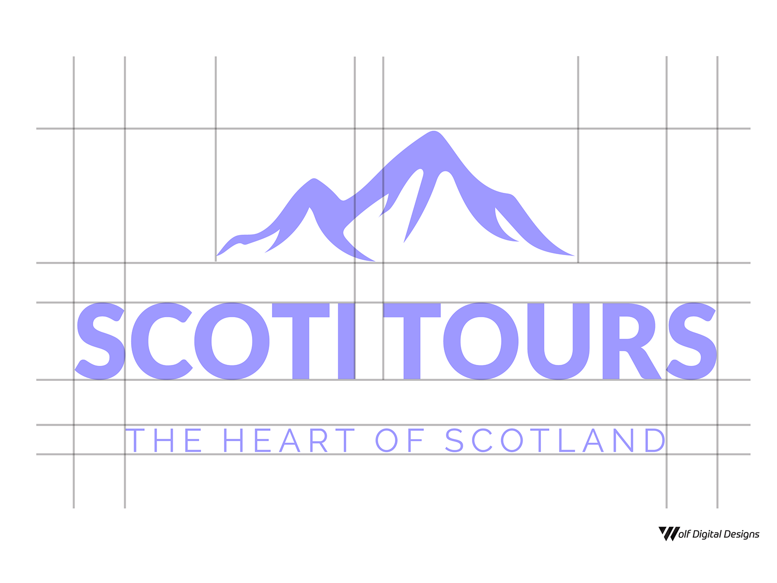
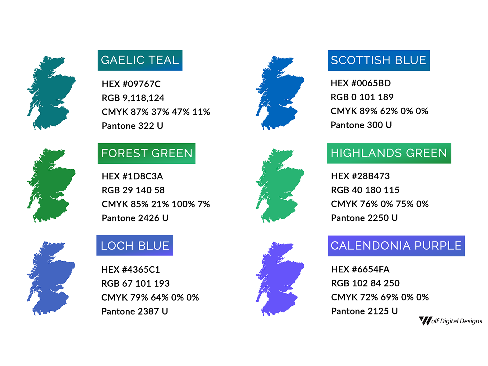
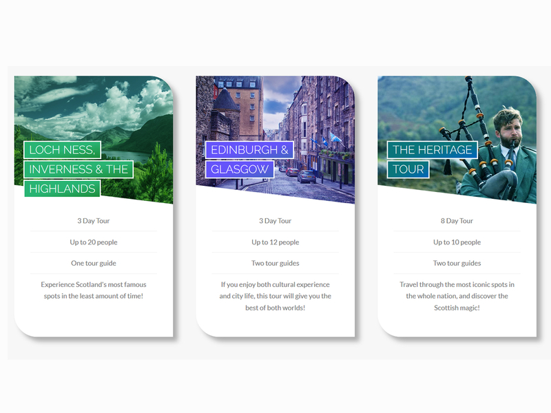
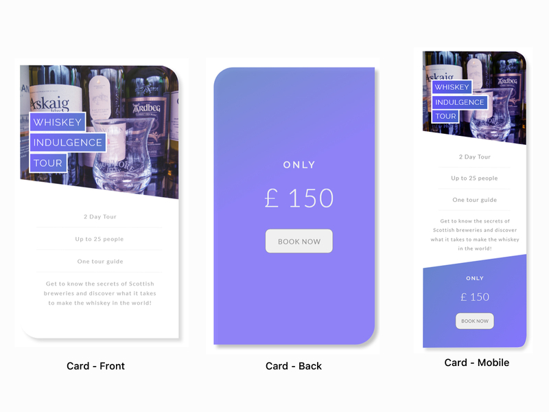
UX Case Study / Scoti Tours ⛰️
7
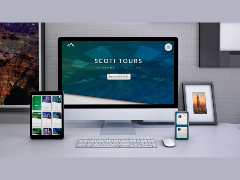
Scoti Tours is a UX case study that I completed back in 2018.
More Projects


7
Scoti Tours is a UX case study that I completed back in 2018.


