Thank you for our friends at Elinext for sponsoring this blog post! Written by Anastasya Babich.
In a world of rapid technological advancement, where new devices emerge every month and web browsers are constantly being improved, it’s easy to overlook some fundamental questions:
Who is the product being created for?
What are the users’ needs, and what constraints might affect their interaction with the product?
The principles of universal design and web accessibility remind us of the importance of ensuring that the internet is accessible to all. When designers talk about accessibility, they often mean the need to adapt interfaces for people with various physical limitations — according to WHO data, one in every six people worldwide faces a serious disability.
Furthermore, in the context of universal design, we have to consider the diversity of devices and browsers through which users interact with our products.
Adaptation to Different Browsers
There is still a significant portion of people in the world using outdated browsers. For example, approximately 28 million people worldwide still use Internet Explorer. Ignoring the needs of such users puts us at risk of losing a significant portion of our audience as well as potential customers.
There are two methods to address display issues on outdated browsers: Graceful Degradation (GD) and Progressive Enhancement (PE). They both share the same goal: create websites and applications that work well no matter the age of the browser. Both approaches ensure access to key information even under limited conditions, which increases conversion rates and audience loyalty. However, they differ in the way they achieve these objectives.
Graceful Degradation
GD starts with creating a website optimized for modern browsers. Then, gradually, some features and visual elements are simplified to support older versions. The website retains its core functionality across all browsers, but in older ones, it appears simpler, and some secondary features may be unavailable.
An example of GD could be likened to an escalator that, when it breaks down, turns into a regular staircase while still maintaining its primary function. In contrast, when an elevator breaks down, it becomes unusable.
Without adaptation, users of outdated browsers are unable to load your website. This deprives potential customers of the ability to take targeted actions, even if they are willing to do so.
In other words, website adaptation automatically expands the circle of potential buyers.
Progressive Enhancement
Unlike GD, where you start with the full version and then simplify, in PE, we go in the opposite direction. We start with a basic version of the website that the oldest browsers can handle and then gradually expand functionality for more advanced browsers.
Which Approach to Choose
When choosing between PE and GD, it’s important to consider the unique goals of each project to guide the decision-making process. Let’s examine cases where each approach should be applied.
Graceful Degradation should be used if:
✨ Visual and functionality are prioritized
GD is suitable for projects where modern and high-functioning design is the driving factor, and support in older browsers, while essential, is not the main focus. The GD approach allows for the immediate creation of an impressive primary version of the website, which can then be gradually adapted to older browsers.
✨ Limited resources
If you have limited time and resources, GD would be the preferable option, as this approach allows you to quickly implement the primary version, with adaptation implemented later.
✨Need to adapt an existing website
GD is indispensable if you need to adapt an existing website to older browsers when that site was initially developed only for modern ones.
Progressive Enhancement should be used if:
✨ Resilience is prioritized
PE is suitable for projects where resilience and accessibility are the main priorities. Creating a strong foundational functionality ensures reliable operation across all browsers.
✨ The website has a wide user base
PE ensures universal content accessibility across all browsers. This approach is particularly important if a significant portion of the target audience comprises elderly individuals, as they often use older browsers. For instance, this applies to websites of medical institutions.
✨ High performance is prioritized
PE is the ideal choice for optimizing performance and ensuring fast website loading. Performance directly impacts sales levels. According to Portent statistics, a website that loads in 1 second has a conversion rate three times higher than a website that loads in 5 seconds.
How designers should tackle this
Successful implementation of projects using either PE or GD requires close collaboration between the designer and the developer. The developer is responsible for technical implementation, while the designer focuses on maximum accessibility, usability, aesthetics, and conversion rates.
To determine which approach is best, you must understand the project’s business goals — which means learning the preferences of target users with respect to their browsers. This can be determined through research, analytics, and studying competing products, and the data obtained will help decide whether to use PE or GD.
Once the choice is made, you can begin the step-by-step work on the website:
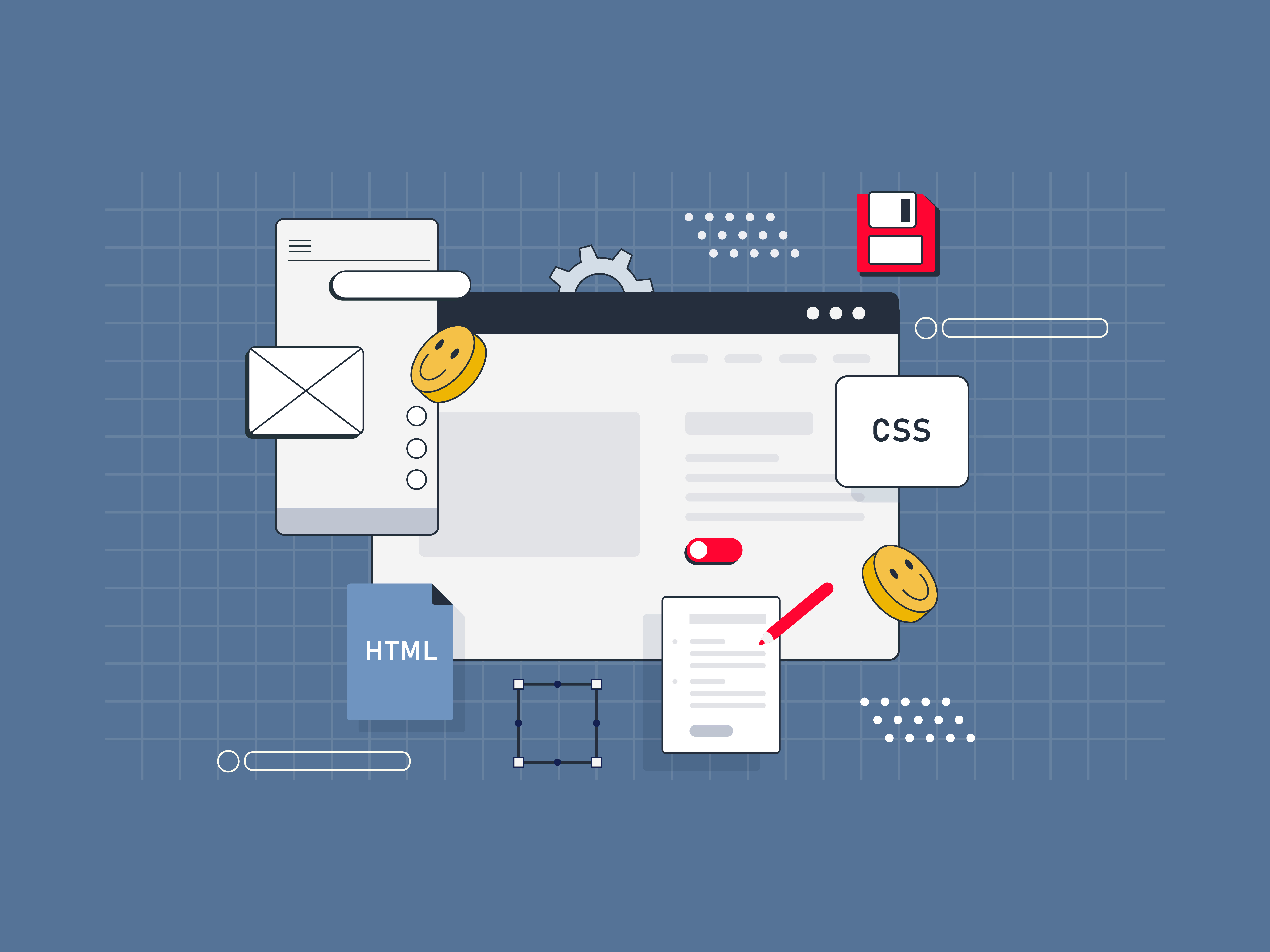
- Creating the HTML foundation: Initially, the designer defines the key functions of the site, plans the logical structure, and develops the textual content. The developer then creates a fully functional HTML page based on these inputs, which can be displayed in any browser.
- Basic visual styling in CSS: The designer determines the basic style of the site, including colors, fonts, layout grid, and element positioning. The developer implements these solutions using CSS, making the page more visually appealing. However, at this stage, the page may appear modest due to limited CSS capabilities.
- Advanced visual styling in CSS3: At this stage, you can add some sparkle to the site by integrating more advanced visual effects such as transparency, shadows, animations, transformations, and gradients using CSS3.
- Interactivity with JavaScript: In the final stage, the designer plans interactive and dynamic elements such as dropdown menus, tabs, sliders, notifications, and filters. The developer implements them using JavaScript. Once this is done, the site is ready to go live.
Using PE, we go through these steps, focusing primarily on older browsers and basic functionality. In GD, at the beginning, we rely on modern browsers, gradually simplifying the code for older ones.
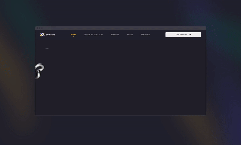
Stages of PE that were implemented in one of Elinext’s projects
 Dribbble Link
Adapting to Different Devices
Now let’s focus on approaches used to ensure access via different devices: desktops, tablets, or mobile. According to GoodFirms survey results, 73.1% of surveyed designers cited lack of adaptation for different devices as the main reason for user churn on websites. Therefore, if you don’t want to lose users, ensuring website accessibility across different devices is essential.
For adapting websites to different screens, two methodologies stand out: classic Adaptive Design (AD) and the more modern Responsive Web Design (RWD). In the first scenario, separate designs are created for different resolutions; in the second, a single design is used that automatically adapts to different screens.
Additionally, there are variations of adaptive and responsive design: Mobile First (MF) and Desktop First (DF). They determine where development begins: a mobile or desktop device.

Responsive Web Design
Responsive Web Design is a method of website development through which the site automatically adjusts to different screen sizes, whether it’s a computer, tablet, or smartphone.
Unlike Adaptive Design, where multiple versions are created for one page intended for different devices, Responsive Web Design creates a single “fluid” page that adjusts itself to the screen resolution.
RWD is only applicable to sites with a flexible structure capable of adapting to various sizes.
RWD on one of the Elinext projects:
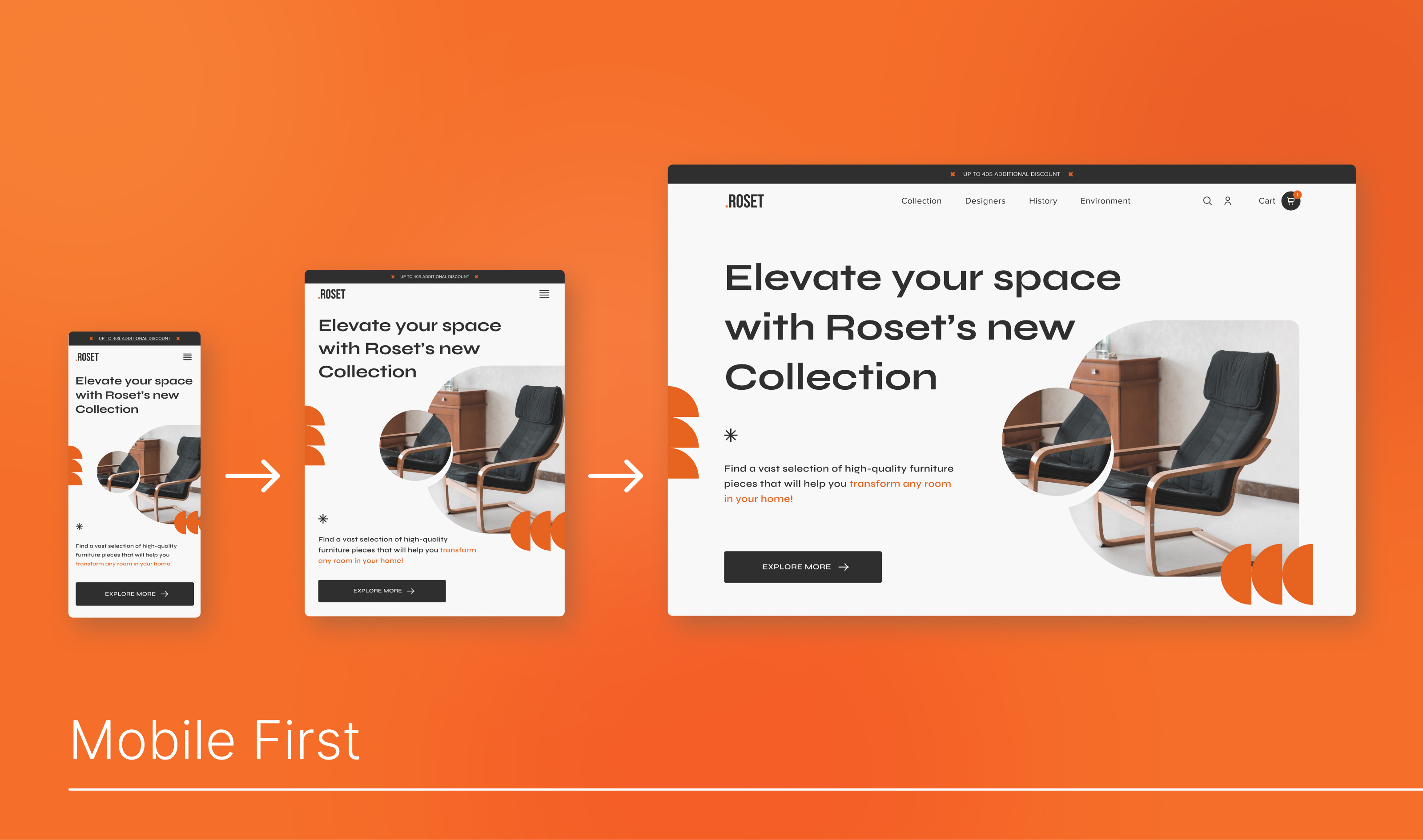
Mobile First
According to DataReportal’s Digital 2023: Global Overview Report, 92.3% of users prefer to use mobile devices to access the Internet. It is precisely because of the popularity of mobile devices that the MF approach emerged.
MF is a development methodology that starts with a simple mobile design and gradually adding complexity for larger screens. This approach contributes to improved performance, faster page loading times, and consequently, increased user satisfaction and improved conversion rates from mobile devices.
An example of implementing MF on one of Elinext’s projects:
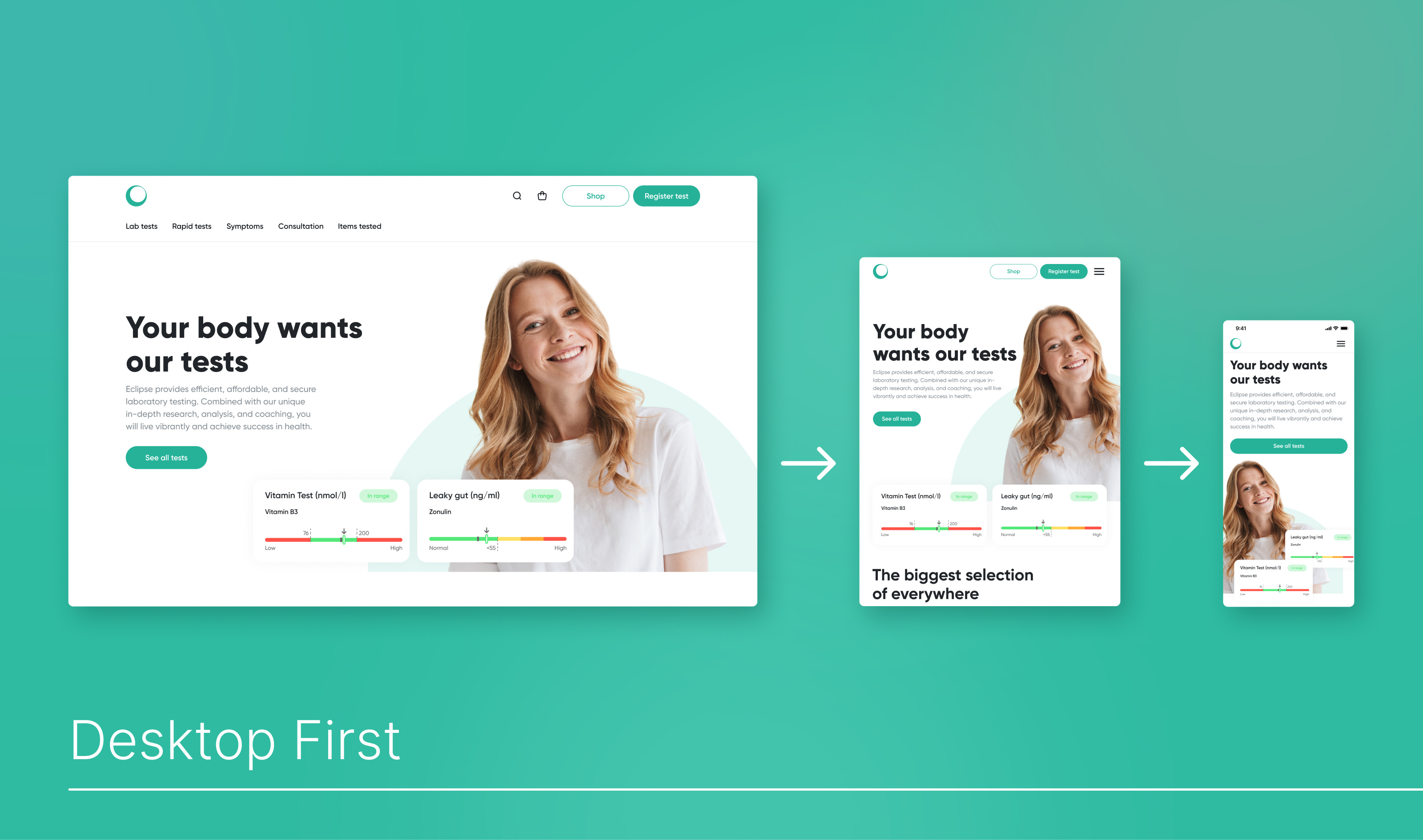
Desktop First
DF is a classic development approach that begins with creating a full version for desktop with gradual adaptation toward mobile devices. Desktop First is more familiar for many teams, as it follows traditional development methods.
DF utilizes the capabilities of desktops, allowing for the creation of a rich, visually appealing interface. However, focusing on desktop devices may complicate the site’s ability to adapt to mobile devices.
DF on one of Elinext’s projects:
Responsive vs Adaptive, Mobile First vs Desktop First
Let’s consider in which cases each method would be most advantageous.
Responsive Web Design (RWD) would be preferable if:
✨ Time and resources are limited
RWD eliminates the need to create and maintain different versions for different devices.
✨ Universality is a priority
The site adapts to all devices, providing a unified code and content for all screen resolutions.
✨ SEO optimization is important
RWD contributes to improved SEO performance since you have one URL and the same HTML code for all devices, leading to increased website traffic.
Adaptive Design (AD) would be preferable if:
✨ Flexible control is needed
Adaptive design provides more flexible and precise control over display on various devices and screens since adaptation occurs manually.
✨ High-quality UX is a priority
AD is more costly in development and maintenance, but in cases where a higher level of UX is important, it’s justified.
✨ Adapting an existing website
AD is used when it’s necessary to create mobile and tablet versions of an existing website without undergoing a complete redesign.
Mobile First will be preferable if:
✨ Your audience consists of mobile device users
If your target audience prefers using mobile devices to access the internet, then employing the MF approach logically enhances user satisfaction.
✨ Good performance is a priority
If you aim to reduce page loading times, opting for MF is advisable. Pages created using this method load very quickly, which increases conversion rates.
✨ There are mobile-centric featuresIf your website includes features optimized for use on mobile devices (e.g., geolocation or a camera), MF is the right choice.
✨ Search engine ranking is a priority
MF increases visibility since search engines prefer mobile-optimized websites. This leads to attracting more visitors through search queries.
✨ Focus on simplicity of perception
The limited space on mobile devices requires focusing on key functionality, avoiding excessive details and distracting elements. You thereby increase the chances of users performing the desired actions.
Desktop First will be preferable if:
✨ Your users prefer desktop devices
In this case, DF will obviously be preferable and will increase audience satisfaction.
✨ Complex functionality is present
DF is ideal for projects where requirements dictate the use of large screens and mice.
✨ Visual experience is a priority
Desktop First
allows maximizing the visual capabilities of web design, including high-quality graphics, impressive animations, interactive elements, and videos.
✨ There is already an existing desktop version
DF is indispensable if you already have a desktop version of the website and plan to adapt it for other devices.
Making the right choice and implementing the correct development methodology positively affects audience reach, conversion, and user satisfaction.
Conclusion
In a world where competition is growing daily, accessibility becomes an increasingly integral element of successful products, benefiting both businesses and their customers.
We have explored various methodologies for enhancing product accessibility. To make the right choice and apply it effectively, you must understand the needs of the business, carefully study the audience, and analyze user preferences. For example, if statistics show that almost all website visitors use modern browsers, there is no point in spending resources on supporting outdated ones.
If you’re looking for skilled UX/UI designers, Elinext is here to be your reliable UI/UX partner. With over 26 years of experience, Elinext specializes in creating appealing designs and also in developing user-friendly software solutions aimed at achieving your business goals through intuitive user interfaces.
Find more Community stories on our blog Courtside. Have a suggestion? Contact stories@dribbble.com.


