
Thanks to our friends at Judo for sponsoring this blog post!
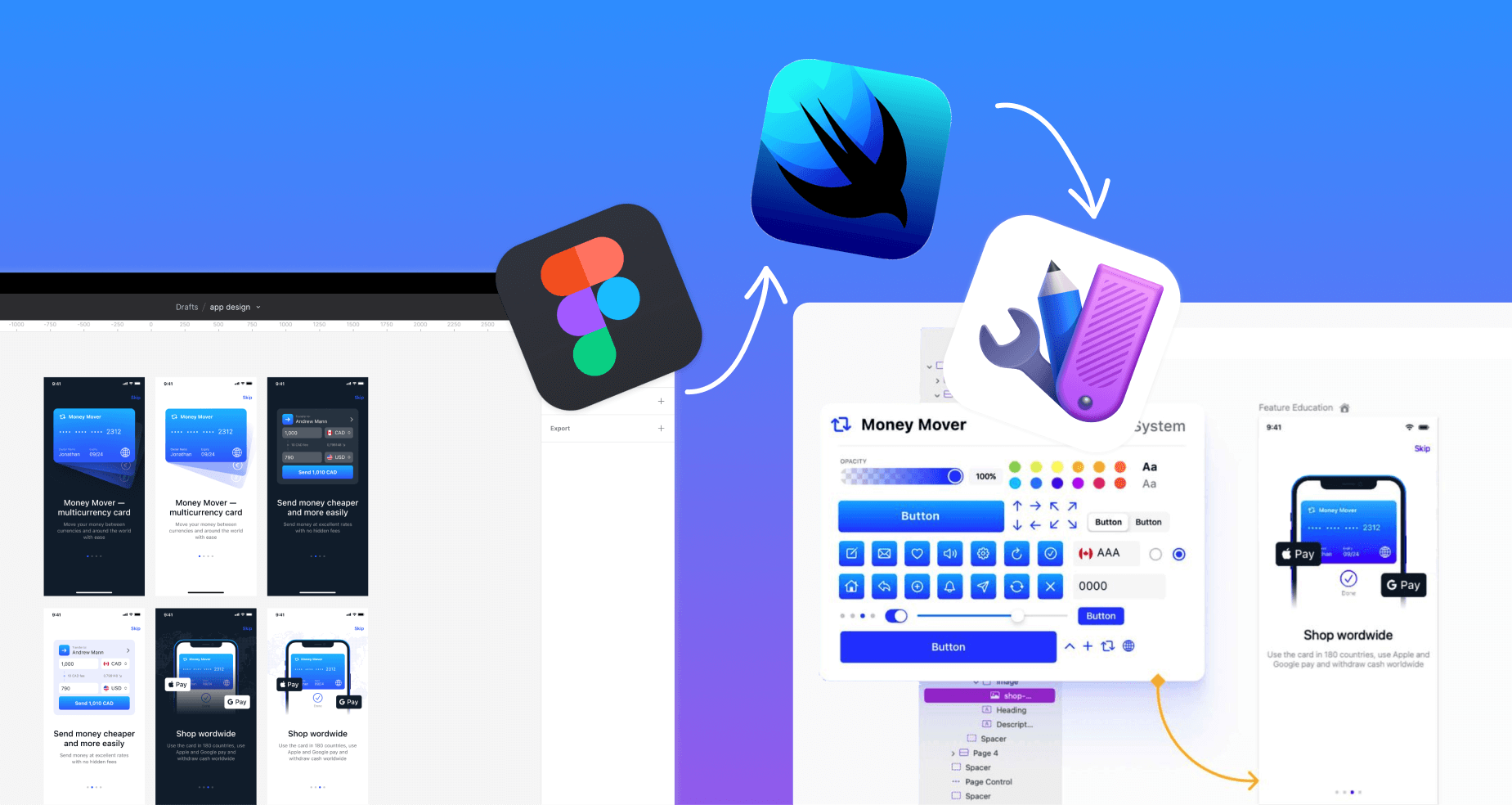
As designers traverse the ever-evolving digital landscape, there’s an increasingly unspoken expectation: get technical or get left behind. Understanding the technical constraints of the platform you are designing for not only makes you a better designer, it has a significant impact on your team’s workflow. While improvements to Figma (developer mode) are helpful, they are no replacement for understanding key concepts of the framework your developers will use to turn your designs into software.
Mastering the interface between design and development is no longer a luxury, but a necessity. And in this age of streamlined workflows, understanding the intricacies of SwiftUI from a Figma perspective is a must for those designing for iOS. Let’s take a look..
1. Components & Custom Views: Design’s Dynamic Duos
Figma: Components are your design superheroes. They are reusable pieces, ensuring uniformity and reducing redundancies. Think of them as the DNA building blocks of your design ecosystem.
SwiftUI: Enter Custom Views. Much like Figma’s components, these views are reusable chunks of UI. But they don’t just stop at buttons or text fields; SwiftUI pushes boundaries with complex elements like tables and lists.
Reusability means efficiency. Any modification in a custom view cascades throughout the app, ensuring both consistency and time-saving.
2. Properties & State Variables: Control at Your Fingertips
Figma: Properties aren’t just settings; they’re your design control panel. Size, position, color, font – these parameters enable nuances and brand consistency. And with prototyping tools, properties morph into dynamic animation engines, bringing interactivity into play.
SwiftUI: This is where State Variables shine. Think of them as the heartbeats of your app, keeping the UI alive and dynamic. SwiftUI’s ‘@State’ is your magic wand here, binding these variables with views, ensuring an immediate reflection upon any state change.
3. Auto Layout Versus Stacks & Spacers: Crafting Fluidity
Figma: Auto Layout is like your design’s yoga instructor. It enables flexibility, ensuring that designs are responsive and fluid. Setting constraints gives you the power to dictate the spatial dynamics of your design elements.
SwiftUI: VStacks and Spacers are your answer to responsive design in SwiftUI. While stacks arrange your child views vertically and horizontally, Spacers introduce the much-needed breathing room. Like Tetris, for designers: arranging, spacing, and making everything fit perfectly into various screen sizes.
4. From Figma’s Inspector Panel to SwiftUI Modifiers: Tailoring UI Elements
Figma: The Inspector panel is a designer’s cockpit in Figma. It’s where every tweak, adjustment, and fine-tuning happens – be it opacity, corner radius, or blending mode. This panel is essential for turning a raw design element into a polished visual piece.
SwiftUI: Enter Modifiers – SwiftUI’s answer to Figma’s Inspector panel. With Modifiers, designers can adjust and customize views, adding depth, interactivity, and dynamic behavior. It’s more than just aesthetics; Modifiers let you determine how a view responds to user input, adapts to different devices, and transitions between states.
Grasping the power of Modifiers in SwiftUI allows designers to envision not just how an element looks, but how it behaves. This understanding bridges the gap between a design’s static representation in Figma and its dynamic rendition in SwiftUI. A button isn’t just about its gradient and corner radius; it’s also about its press effect, haptic feedback, and transition to the next screen.
By understanding Shapes and the transition from the Figma Inspector Panel to SwiftUI Modifiers, designers can more effectively translate their vision and intentions when collaborating with developers.
Final Byte
SwiftUI isn’t just for developers. For designers, it’s a goldmine of opportunities, a canvas waiting to be painted on. By bridging the gap between Figma and SwiftUI, we’re not just enhancing collaboration; we’re redefining it. To go deeper on this topic and learn more about SwiftUI for designers, dive into Judo – a visual canvas for SwiftUI that is familiar to designers and welcomed by developers. Ready for a game-changer? Start designing and building SwiftUI today.
Find more Community stories on our blog Courtside. Have a suggestion? Contact stories@dribbble.com.


