Thanks to our friends at BugHerd for sponsoring this blog post!
Author: Richy Vong, Design Lead @ BugHerd. “Product design or marketing design… 10 years on, I still can’t decide which one I most enjoy. So why not both? 🤷🏻” AMA @BugHerd
Or they’ll be too inconclusive to implement. Pick your poison.
In this article, we’ll share 5 experiments we’ve tried at BugHerd that have had the biggest impact in driving growth.
Forget about testing a red button vs blue button. Here’s what we’ve found that really works….
(In this article, I will use the phrases ‘AB test’ and ‘experiment’ interchangeably. As far as I’m concerned, they are the same thing)
Intro
If you’re a Product, UX or Web Designer focusing on conversion rate optimization (CRO), you’ve probably come to realize that it’s really not that easy to move the needle – Whether it’s getting more leads, improving the onboarding experience, or converting users to paid customers.
When I first began my journey as a CRO-driven designer, I scoured the internet for ideas and “best practices to try”. Perhaps that’s what you’re doing right now as you read this article.
It’s easy to become emotionally invested in the experiments you suggest to your team and even easier to become disheartened when you go through a string of experiments without a win.
At the end of the day, all designers want to demonstrate their value and expertise to their team, and you want to do that by showing that you can move the needle.
Want to know the truth? In my history of AB tests, the number of losing experiments far outnumber the winners. But you only get to the winners with persistence and iterative learning…
Our 5 biggest winners

1. A fresh coat of paint
Designers often wonder, what is the true business value of a redesign?
In this particular experiment, we somewhat aimed to address this question. We took the home page of our marketing website and crafted a version that retained the same content while adopting a refreshed look and feel. The refresh changed elements such as images, colours, layout and typography.
Our hypothesis centerd around the idea that our branding had started to feel outdated and might be hindering our ability to attract leads to try our product. This was especially relevant considering a significant portion of our user base consisted of designers themselves, individuals known for their keen design sensibilities.
The result? The variant outperformed the control by 82%. Simply put, this was a massive win.
The conclusion? We had outgrown our current visual identity, and it was high time to modernize our brand’s visual representation.

2. Turning off our ads
The BugHerd team embarked on a mission to enhance its product onboarding conversion rate: 5 out of 10* leads successfully complete our onboarding process, but we really thought that number should be 7 out of 10*.
However, before we initiated any experiments to improve our product onboarding, we recognized the need to address a fundamental question and ensure we correctly diagnosed the issue:
“Are we experiencing a sub-optimal onboarding conversion rate because of the quality of our onboarding experience, or because of the quality of the leads coming in the door?”
To answer this pivotal question, we made the decision to temporarily halt all our advertising spend aimed at acquiring new leads – leaving us with traffic generated from Organic search and word of mouth (WOM) advertising.
It was the equivalent of having inflammation, and doing a detox in order to pinpoint the foods causing you trouble.
The result? Without paid leads, our onboarding rate lifted to 6 out of 10*. Which was a step in the right direction.
The conclusion? Our ad spend for getting leads needed to be optimised.
*To maintain confidentiality, we have altered the actual figures.

3. Eliminating steps that aren’t mission critical to our onboarding
After turning off our ad spend and determining that the lead quality played a part in our onboarding conversion rate, we were ready to experiment with the onboarding experience itself.
However, before introducing any new elements, our first step was to pinpoint what wasn’t working. And so we sought to remove the parts of BugHerd’s onboarding process that aren’t mission critical.
In BugHerd’s case, a user successfully completed onboarding when they had the opportunity to experience the core value of our product – that is, the ability to provide website feedback on their own website or any website they choose. We refer to this as the ‘ah-ha’ moment.
In order to do that, we ask our trial users to:
- Fill out a survey about who they are
- Enter their website URL
- Add the BugHerd browser extension
- Try BugHerd on their website
- Invite their team to BugHerd
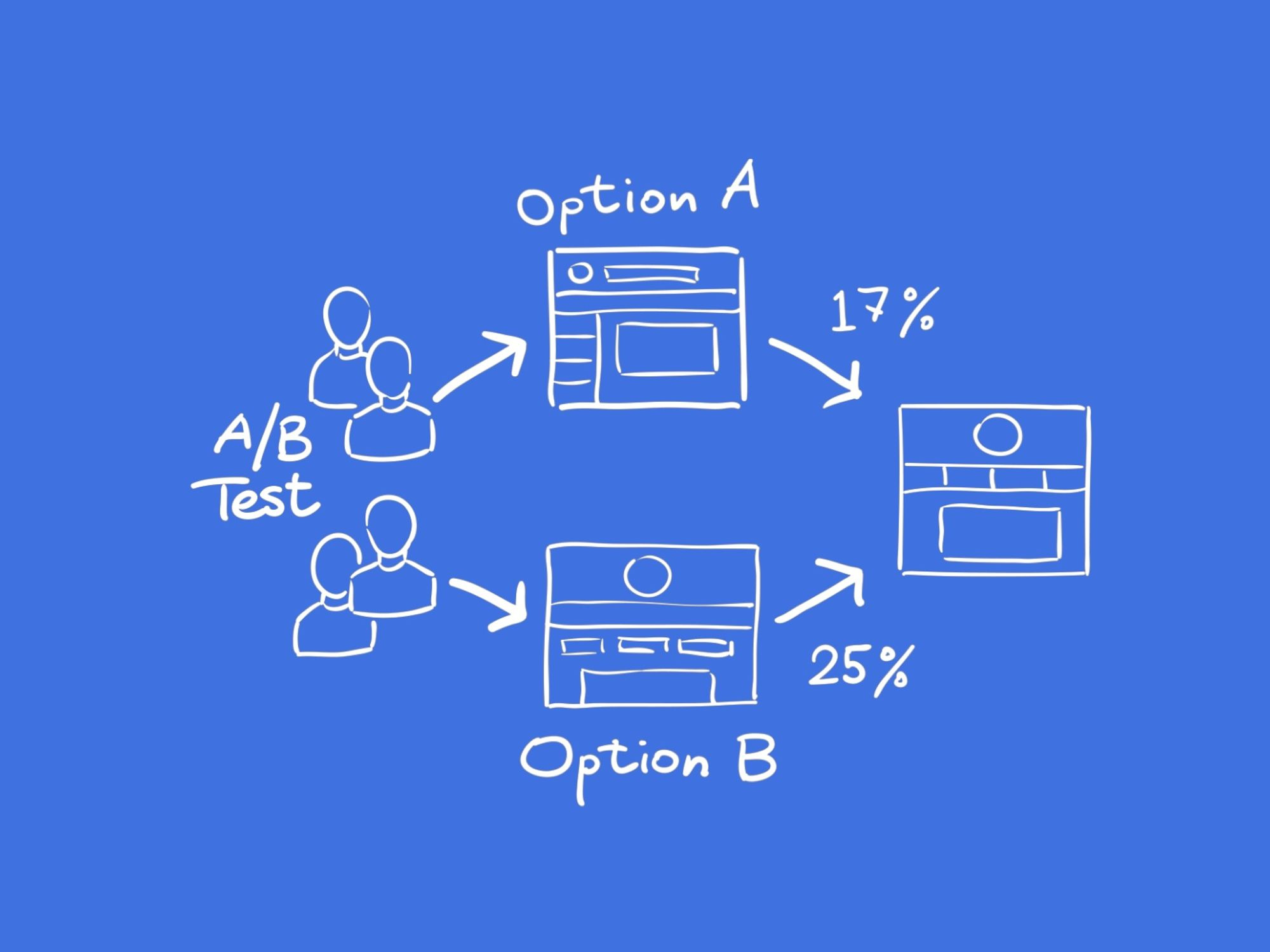
While steps 2 through 4 were absolutely indispensable, step 1, although important, wasn’t as critical. Thus, we conducted an experiment where:
- Control group – users would see steps 1-5 of the onboarding flow
- Variant group – users would see steps 2-5 of the onboarding flow
The result? The variant outperformed the control by 17% in its onboarding conversion rate.
The conclusion? Streamline your onboarding experience to include only the essential steps required to lead new users to that crucial ‘ah-ha’ moment.

4. A very short demo video
The previous experiment focused on reduction. This experiment involved trying something new.
In this particular experiment, we introduced a brief 30-second video explainer at the beginning of our onboarding process, providing users with an overview of what BugHerd is and how to get started in a video format instead of in writing.
Our hypothesis rested on the belief that by allowing new users to experience the ‘ah-ha’ moment early on with easy to digest content, we could enhance their overall onboarding experience. You can watch the video explainer here.
- Control group – users would see our existing onboarding flow
- Variant group – users would see the video, before moving on to our existing onboarding flow
The result? The variant group demonstrated a higher efficiency in navigating the onboarding process, resulting in an 12% improvement. However, it’s worth noting that because we made the video mandatory (i.e. users couldn’t skip it for the first 10 seconds to encourage viewership), we experienced a lower influx of leads.
The conclusion? The conclusion drawn from this experiment was twofold: First, we determined that making the explainer video mandatory should be avoided. Second, we recognized the potential value of using such videos in other parts of our marketing and onboarding process, such as on landing pages or within ads.

5. Pricing page AB test. When more is…. more?
Oftentimes as designers, we tend to adhere to the principle of ‘less is more’ – striving for conciseness and summarization. This inclination is entirely reasonable, considering that many designers have been taught that if you don’t capture their attention within the first 5 seconds, you’ve likely lost them (or a similar lesson along those lines).
In this particular experiment, we directed our focus towards our pricing page and decided to test the inclusion of more detailed information regarding the features encompassed in each of our pricing plans, as opposed to providing less information:
- Control group – users would see our pricing plans summarised in ‘cards’.
- Variant group – users would see our pricing plans in a table format, with more detailed information.
The result? The variant outperformed the control across all the categories we cared about, including lead conversion, time spent on the page and bounce rate.
The conclusion? While brevity plays a crucial role in capturing initial attention (e.g., on ads or landing pages), when your website visitors have reached the stage of contemplating your product in terms of pricing and specific feature inclusions, it’s crucial to provide them with the information they need.

But what happens when…?
Here are some common questions I frequently encounter regarding A/B testing:
1. What happens when you get inconclusive results?
In most cases, an A/B test just needs more time. If you’re getting inconclusive results after 1 week, consider letting it run for 3 weeks.
Still getting inconclusive results after an extended period of time? The general rule is to stick with the control unless you get a statistically significant uptick with your variant.
2. Can I test multiple things at once?
Ideally, it’s recommended to experiment with one variable at a time. This approach allows you to discern what genuinely works and what doesn’t. However, view this as a guideline – not gospel.
We fully comprehend the allure of testing multiple elements concurrently. There could be various reasons for this approach:
- Perhaps you lack a sufficient volume of users to obtain results within your team’s desired timeframe.
- It’s possible that you’ve identified multiple glaring issues with your product’s website or onboarding, especially from a designer’s perspective.
In such situations, use your best judgement.
3. How long does it take to run an A/B test?
At a minimum, an A/B test takes 3 weeks to gather meaningful data. That number can change, depending on the nature of the test and how big the volume of users you have to work with.
Wrap up
And there you have it – our 5 biggest winners in the world of AB tests.
However, it’s crucial to remember that the context of these experiments is key. What proved effective for us might not translate to the same outcomes for other businesses. When gleaning insights from our case studies (or anyone else’s, for that matter), it’s vital to apply first principles.
We hope you’ve enjoyed this read. For more content like this, head over to the BugHerd blog and subscribe to our newsletter.
Find more Community stories on our blog Courtside. Have a suggestion? Contact stories@dribbble.com.


