We’ve all seen websites or digital experiences that we immediately thought of as “bad designs.” But what actually makes a design “bad”? And how do we, as designers, learn to recognize and avoid those mistakes?
Understanding what makes a design bad is the first step in learning how to create good designs. Here are ten common examples of bad design and how to correct their shortcomings.
1. The design is too cluttered
Cluttered designs were commonly seen in the early days of the internet. Designers tried to cram as much as they could onto each page, often ignoring white space entirely. The results were pages that were hard to navigate, lacked structure, and made finding what you were looking for almost impossible.
While the cluttered UIs of 90s design and early 00s have (mostly) disappeared, cluttered designs still exist. While not every website needs to be minimalist, with wide-open spaces between each element, be sure that you’re giving your design some breathing room. Remove unnecessary elements when possible to allow the important parts to stand out.
2. Inconsistencies in your UI
Inconsistent UI is one of the most annoying kinds of bad design. When color palettes change from page to page, navigation jumps around on each page to wherever the designer felt like putting it, fonts seem to be chosen at random, and there’s no unified visual style, users suffer. They have to constantly re-acclimate to each section or page of your site, requiring extra mental effort to achieve their goals. And even small inconsistencies can contribute to this.
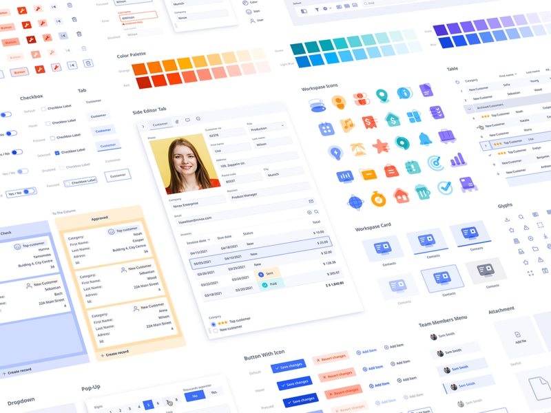
One of the best ways to combat inconsistencies is to create a style guide for your designs. Define the way things should look, including where things like navigation should be placed on each page, what the color palette should be, the typography choices, and even things like the width of lines for icons and dividers.
This will help ensure that your UI remains consistent regardless of changes to the content or involvement from multiple designers.
3. Poor typographic hierarchy
Do people come to your website only to be presented with a wall of text? Text on the web is not the same as text in a book or magazine. A full page of text with no typographic hierarchy is intimidating to visitors and can bore them quickly.
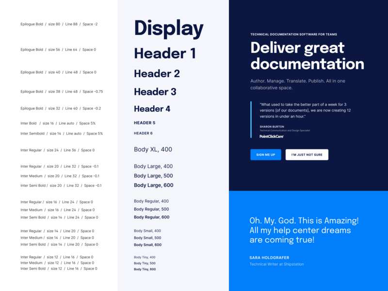
A structured typographic hierarchy that makes it easy to pick out things like headlines and subheads as well as body copy and captions is vital for readability on the web. Good typographic hierarchy generally consists of one or two typefaces used at different sizes, weights, and styles to differentiate between heading levels, body copy, and other text elements.
To further increase readability in digital designs, make sure you use shorter paragraphs, sufficient line heights, and make important content more digestible through the use of things like bulleted lists.
4. Confusing iconography
The entire point of icons is to give visitors a visual cue about the content they’re seeing. Icons are often used for things like navigation. The goal is for users to immediately recognize what an icon represents to make interacting with your site easier.
Universal icons exist for a reason. Namely, that they’re instantly recognizable to users. When you start to experiment with icons or icon sets that have more abstract or metaphorical meanings, all you’re doing is potentially confusing users. If you do stray from universally recognized icons, or need to use icons for something that doesn’t have a universal symbol attached, use labels to prevent confusion.
5. Poor form design
If you’re creating a website to do anything other than provide information, forms are likely part of your UI design— whether they’re forms for users to subscribe, make a purchase, or some other function. Unfortunately, poor form design abounds on the web. And if your forms aren’t user-friendly, you’ll see a much lower submission rate.
There are a few basic things to keep in mind when designing forms:
- Keep your forms as short as possible to achieve the necessary goal. For example, subscription forms should ideally only include a field for the email address, and possibly the subscriber’s name.
- Make submit buttons highly visible and labeled descriptively. For example, use “subscribe” instead of “submit.”
- Make sure your error messages are helpful. Ideally, they should be triggered as the form is filled rather than after submission.
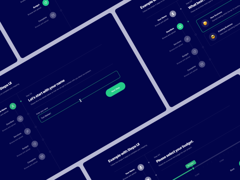
- Break up long forms into smaller pages. A checkout form, for example, might be split into pages for shipping information, billing information, and reviewing the purchase before submitting. Don’t forget to indicate progress to users as they work through these pages.
6. Poor alignment
Bad alignment of elements can make a page feel unpolished even if users don’t immediately recognize why. But fixing your alignment is generally pretty simple. Using a grid to place elements within your design is a simple, established way to maintain alignment. Don’t forget to use a baseline grid, too.
7. Irrelevant imagery
Images and photos should be included in a design to support the content being presented. They should reinforce the ideas and concepts on the page, not distract from them. Make sure that every image you include is directly tied to the page’s content. Cute kitten pics are great, but only if your content is about cats!
📌 Check out 7 best practices for using photography in UI design for more expert tips.
“You should select images that have a strong relationship with your product goals and ensure that they are context-relevant.” — Anastasia Marinicheva, UI/UX Designer

8. Lack of contrast
Bad contrast is more than just visually unappealing. It can also harm the accessibility of your designs. Be sure that the contrast between important elements — including text — on your pages meets accessibility standards. This will ensure that users don’t miss the important parts, as well as make any text content more readable.
9. Poor user research
Not understanding the needs of your audience can lead to terrible design. After all, good design isn’t just about the way a site looks; it’s primarily about how well your design works for your users.
Take time at the beginning of the design process to learn about what your users want and need from your site. Then test different design ideas and iterations to come up with a solution that solves user problems. A design that’s visually mediocre but meets user needs and wants will always be a “better” design than one that looks beautiful but is hard for people to use.
10. Lack of accessibility
Accessibility is too often thought of as an inconvenience. But accessible designs are more usable for all users. Learn the basics of accessibility to create digital products that work better for everyone.
Apply WCAG accessibility standards to all of your designs to improve user experience across the board. Don’t think of them as an inconvenience or a restriction, but instead as a way to make your designs better for all. ■
RELATED RESOURCES
- 10 best web design courses to upskill online
- 11 principles of design (& how to apply them)
- 13 must‑read graphic design books that will shape your career
Find more Process stories on our blog Courtside. Have a suggestion? Contact [email protected].

