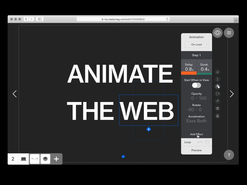
Adding animations to your web designs can be an easy and extremely effective way to increase engagement and create emotional connections with your users. The best part is, you don’t have to know how to code or have experience as a motion designer to create an interactive web experience anymore. With design tools like Readymag , a new generation tool for designing on the web, you can easily create interactive websites in the span of only a few hours.
Today, Product Designer at Readymag Stas Aki shares his insight on the value of an interactive web experience, how to implement web animations effectively, and how to use the Readymag web tool to bring your web designs to life.

When used thoughtfully and intentionally, animation has the power to bring a digital experience to life. We tend to imitate life when it comes to both art and technology—life is not static, it’s motion. When we add motion to visual communication, the message becomes more convincing, expressive, and engaging.
Using web animations to increase engagement
Web animation brings focus to certain parts of the content. It entertains, and through that, inspires emotions which evolve interest in the content. Scroll animations, for example, make readers feel they control the flow of their engagement. As they scroll down, the content of a web page reacts to their fingers. That makes you feel that the content is somehow personalized.

Do’s and don’ts of web animation
- DO use animation to guide your readers through the content of your website. Doing so maintains a visitor’s attention and keeps them engaged.
- DO use animation to focus a viewer’s attention on specific details within the content. For example, by animating the size of photos you can indicate the order in which they should be viewed.
- DON’T overdo it: You must be careful with not overdoing animations on your page as it takes both additional page load and user attention. Use it for purpose, not just to impress your visitors how cool your website is. Begin with a basic layout that conveys the essence of the project then get motion on board and bring it to life.
Animating with Readymag
Within Readymag, you can animate most widgets (or elements of the page) by selecting a trigger. After you’ve chosen trigger type, you add one of the effects that might happen with the widget. You can move it, change its opacity, scale, or rotate it. With this combination of triggers and effects, you can get infinite variations. Also, you can cause the animation of one widget by clicking on it or hovering over another widget. This makes your possibilities almost infinite.
In Readymag, you don’t work with the timeline and keyframes. All you need is to set properties for the transition between two states, with desirable animation speed. Add further animation steps if needed. You can do that by typing values or manipulating a widget directly on the page. After that, you can check the result in the preview mode right away. It’s as simple as that.
Get inspired
There are plenty of designers doing web animations right. I really like what Wolff Olins has done in recent years in terms of adding motion to their branding projects . Readymag users have also been using animation in very creative ways. A few favorites are Readymag sites like the Russian Spleen project at the Jewish Museum and Tolerance Center , Enso Magazine’s feature on Charles and Ray Eames , and 20 Most Important Inventions of All Time . These should give you a sense of the kind of animation Readymag supports and will hopefully inspire you to incorporate animation in your own web projects!
If you’re new to animation
My biggest piece of advice for designers new to web animations is shooting a video before everything else. You’ll get the sense of how a motion picture is being created. Then, master Adobe After Effects or Final Cut Pro to cut what you’ve shot and to work with the timeline. This way, you’ll get all the basics of creating a picture.
Interested in trying out web animations for yourself with Readymag? Register for a free plan at readymag.com and follow Readymag on Dribbble, Twitter, and Instagram
Find Stas on Dribbble, Instagram, and at stasaki.com.
Find more Interviews stories on our blog Courtside. Have a suggestion? Contact stories@dribbble.com.


