Daily UI #028 | Contact Us
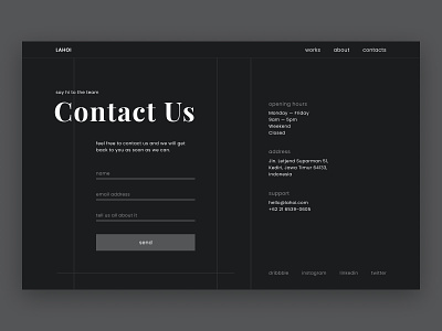
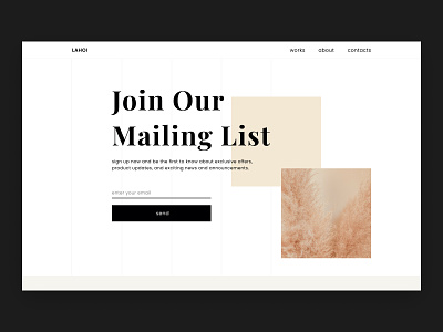
I made this contact page for the purpose of style exploration—and to practice working with Figma again. This shot is a rebound of my previous shot in which I practiced this style of design before.
On this page, I placed the most important elements as the user would require getting in touch with the company. The main element is the contact form. It’s used to contact the company straight from their website. After that comes the information about the opening hours, the address and other ways to contact them. I placed this information on this page, because this information is often placed on the contacting page as well. Making it likely that those seeking this information would expect it to be here.
On top of that, there’s the option to contact the company through their social media channels. By providing more than one contacting option, the user may choose for himself which way of contacting they are most comfortable with. Presumably making them more likely to fulfil the purpose of this page—which is to contact the company.

