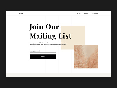
Daily UI #026 | Subscribe
I made this subscription page for the purpose of style exploration—and for me to practice working with Figma for the first time ever. I experimented with the layout of the elements on the page to try and create an off–grid effect.
The context of the page is to persuade users to subscribe to the company’s mailing list by presenting the benefits of subscribing. By using clever visual hierarchy to guide the user’s attention, this message should become clear without requiring further explanation.
More by Jeffrey Thümann View profile
Like
