About this Service
A dashboard is only useful when people can quickly understand what matters, what changed, and what they need to do next.
Complex products often contain large amounts of data, workflows, permissions, and actions. Good dashboard UX turns that complexity into a clear system — without overwhelming the people using it.
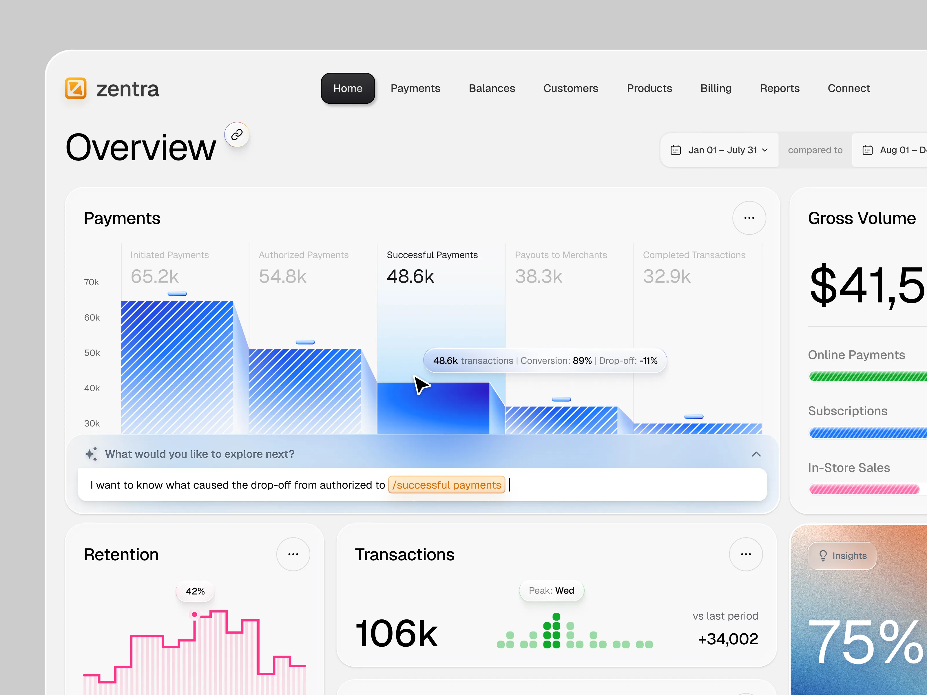
I design SaaS dashboards, admin panels, analytics platforms, ERP systems, CRM products, AI tools, and B2B software with a strong focus on usability, hierarchy, scalability, and polished visual design.
What You Get
Dashboard UX strategy & user flows
Information architecture
Wireframes & workflow design
High-fidelity dashboard UI
Data visualization & analytics UX
Tables, filters, forms & complex states
Responsive layouts
Interactive Figma prototype
Scalable design system
Developer-ready Figma handoff
Process
Product & Workflow DiscoveryI understand your users, business goals, data, roles, permissions, and core workflows before defining the interface.
UX & Information ArchitectureComplex information is organized into clear navigation, page structures, workflows, and priorities.
Dashboard UI DesignI transform the approved UX into a refined interface where typography, spacing, components, charts, tables, and actions work as one system.
Prototype & Key StatesImportant workflows and interactions are connected in Figma, including the states users encounter while completing real tasks.
Design System & HandoffReusable components, patterns, styles, and organized files help maintain consistency as the product grows.
A great dashboard doesn't show users everything at once. It helps them see the right information at the right moment and act on it with confidence.