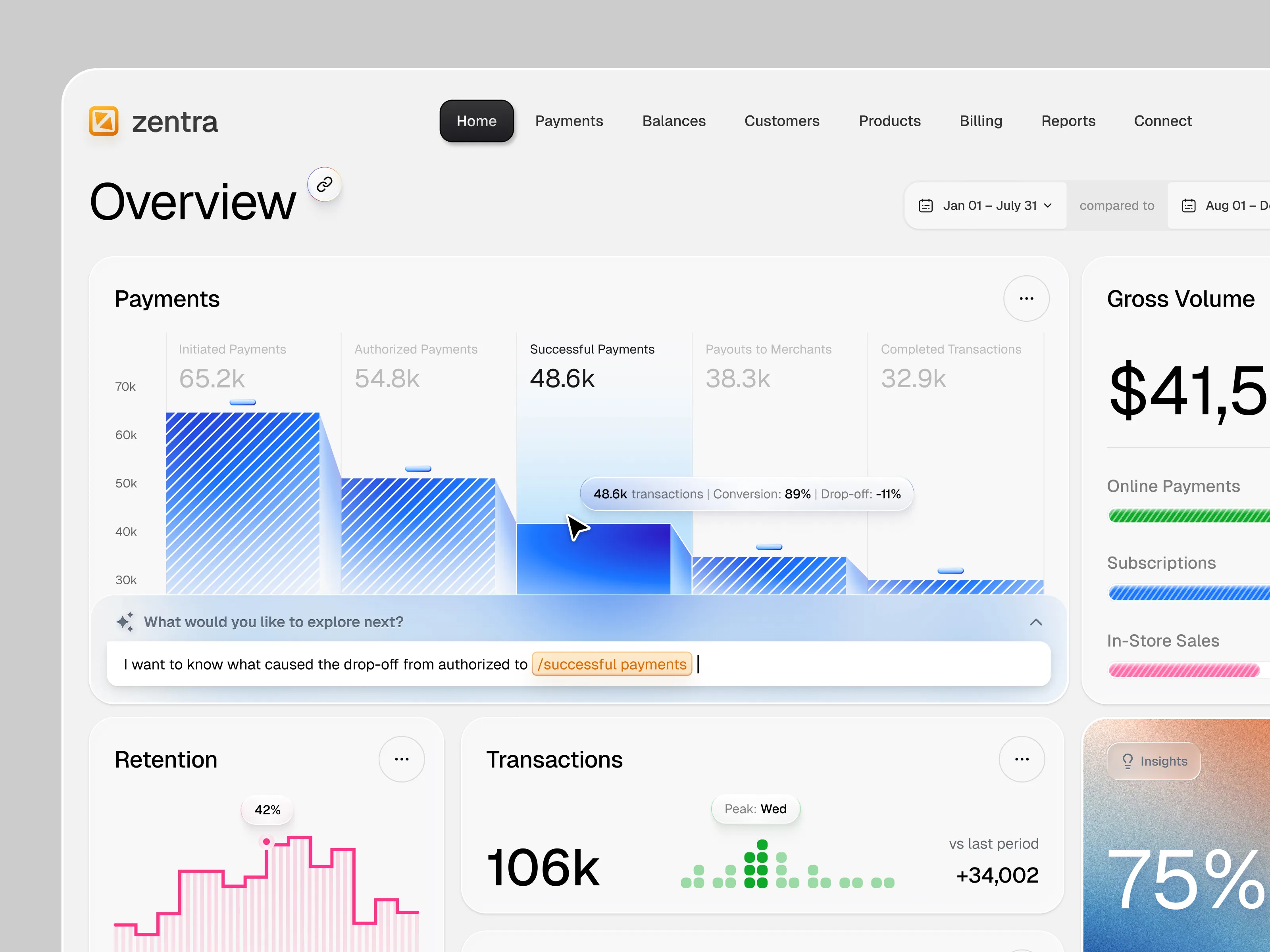

About this Service
TURN COMPLEX DATA INTO CLEAR, ACTIONABLE EXPERIENCES.
A strategic dashboard UX/UI design service for SaaS platforms, admin panels, analytics products, and data-heavy digital tools.We organize complex information, workflows, metrics, and controls into interfaces that are easier to understand and use.The result is a scalable, developer-ready dashboard designed around real tasks, user priorities, and business goals.
What’s included
Kickoff & product discovery
Business, user & competitor review
Dashboard goals & UX strategy
Feature & requirement review
User roles & permission mapping
Information architecture
User flows & journey mapping
Dashboard navigation structure
Wireframes for key screens
Data hierarchy & content prioritization
KPI & metric visualization
Charts & data visualization
Table & filtering UX
Search, sorting & pagination patterns
Dashboard UI design
Up to 10 core screens
Responsive layouts
Design system & reusable components
States, errors & empty screens
Interaction & micro-animation direction
Interactive prototype
Developer-ready Figma file
Design specifications & handoff
Final QA support
Who is this package for?
This package is built for SaaS companies, FinTech, RegTech, AI platforms, analytics products, admin systems, and data-driven digital businesses. It is especially useful for products where users need to understand large amounts of information or complete complex workflows quickly. You can use it to build a completely new dashboard or redesign an existing interface that has become difficult to use or scale.
What happens during the project?
We start with the information and tasks behind the interface, not by immediately styling charts and cards. We define hierarchy, navigation, workflows, user roles, and data relationships before developing the visual system. The process follows Discover → Structure → Flow → Wireframe → Visualize → Design → Prototype → Handoff.
What will I receive?
You will receive a complete dashboard UX/UI system in Figma covering the agreed screens and primary user flows. The delivery includes responsive interfaces, reusable components, visualization patterns, interaction states, and an interactive prototype. Everything is organized for efficient implementation and future expansion by your product and development teams.
Can you redesign an existing dashboard?
Yes. We can audit an existing dashboard and identify problems with navigation, hierarchy, usability, consistency, and data presentation. We preserve workflows that already work while simplifying areas that create friction or unnecessary cognitive load. The redesign can cover the full dashboard or focus on specific high-value workflows and screens.
Can you design complex data visualizations?
Yes. We design charts, tables, KPI modules, comparison views, filters, and other visualization patterns based on the information users actually need. The goal is not to add more charts, but to make important information faster to interpret and act on. For highly specialized scientific or financial visualization requirements, we define the scope with your domain experts first.
Can you design different user roles?
Yes. Dashboards often need different experiences for administrators, managers, customers, analysts, or other user types. We can map role-specific navigation, permissions, workflows, and information priorities as part of the UX architecture. Complex permission systems or many user roles may require a custom project scope.
Does this include development?
No. This package focuses specifically on dashboard UX/UI design. We deliver developer-ready Figma files, components, responsive behaviors, states, and interaction specifications. We can also collaborate directly with your development team throughout implementation to resolve design questions.
Do you offer custom packages?
Yes. The standard package covers up to 10 core dashboard screens and a defined set of key workflows. Larger platforms, multiple portals, extensive role systems, advanced analytics, mobile apps, or large-scale design systems can be scoped separately. We define the product complexity before starting so the scope, timeline, and deliverables remain predictable.
Why choose RhinoGraph?
A dashboard can look clean and still be difficult to use. We combine UX architecture, product thinking, interface design, data visualization, and scalable design systems to reduce complexity, not just decorate it.