

About this Service
Most SaaS dashboards overwhelm users with cluttered data and confusing navigation. When users can't find insights quickly, engagement drops, productivity suffers, and customer retention declines.
We design SaaS & AI Product Dashboard UI that transforms complex data into intuitive experiences, improves user productivity, and helps businesses scale with confidence for SaaS startups, AI platforms, B2B software companies, and enterprise products.
What you get:→ Complete dashboard UI/UX design overview, analytics, reports, settings, user management, billing, and admin panels→ Desktop, tablet, and responsive dashboard layouts→ User flow mapping, information architecture, and conversion-focused UX strategy→ Design system with reusable components, charts, data visualization, and interaction states→ Figma source file + developer specifications→ Optional: Frontend dashboard development
Our process:
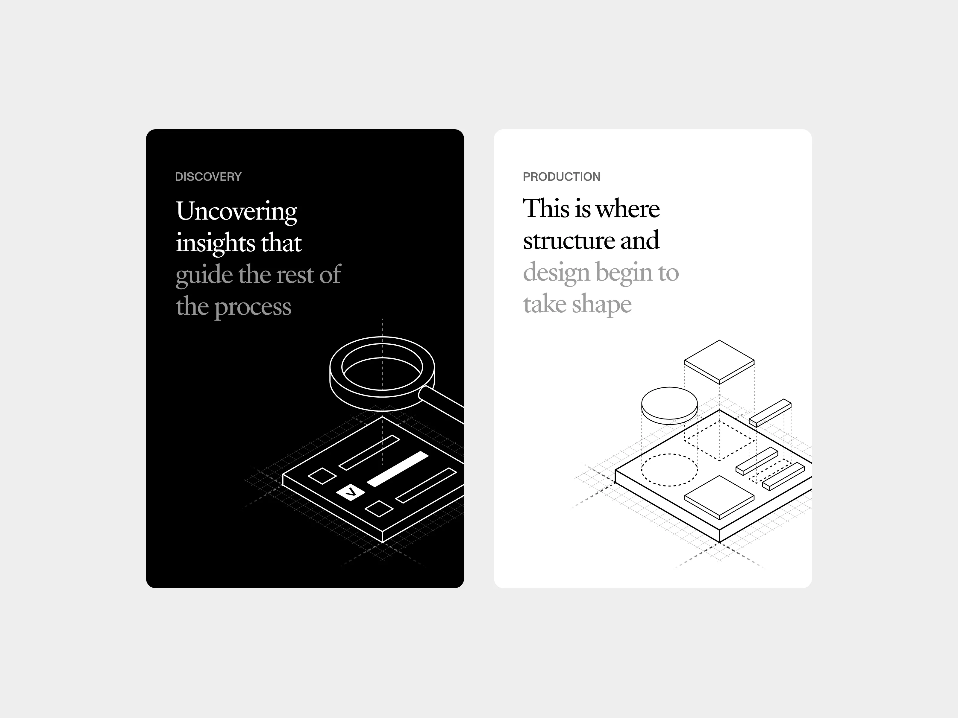
Discovery — we analyze your product, users, workflows, KPIs, and business objectives
Design — we build intuitive dashboard experiences that simplify complex workflows and improve decision-making
Revisions — 10 rounds of feedback until it's exactly right
Handoff — Figma file + dev specs
Why Olack:→ 7 years designing SaaS, AI, fintech, healthcare, and enterprise products, we understand product UX, data visualization, and user behavior→ Team of 6+ designers per project, not a solo freelancer→ 70+ clients served · 4.8 Google rating · Trusted in 15+ countries
Ready to turn your dashboard into a product users actually enjoy using?
Message us, and we will respond within 2 hours.