Get 20% (up to $100) off your first payment for design and development services on Dribbble! Use code WELCOME20 🎉
13 Shots • 9 Attachments
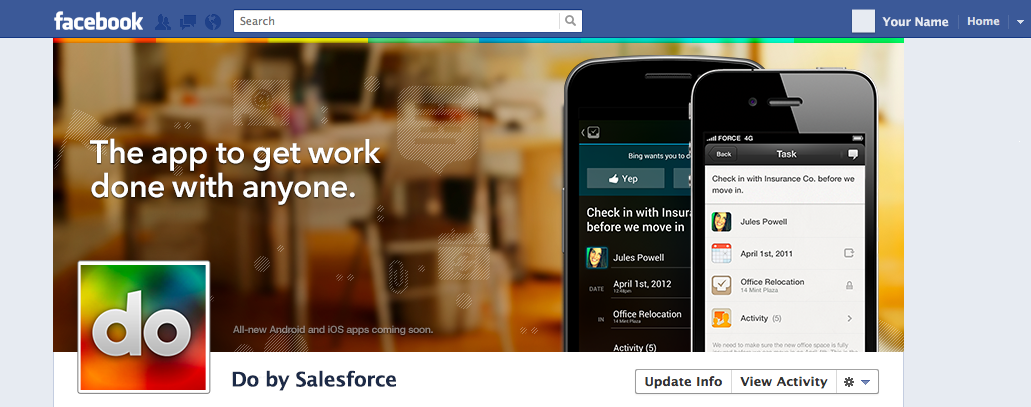
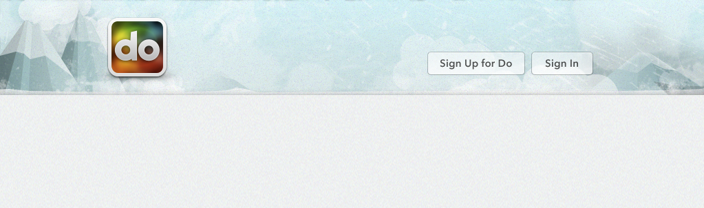
The cover of Do (do.com).
September 10, 2012
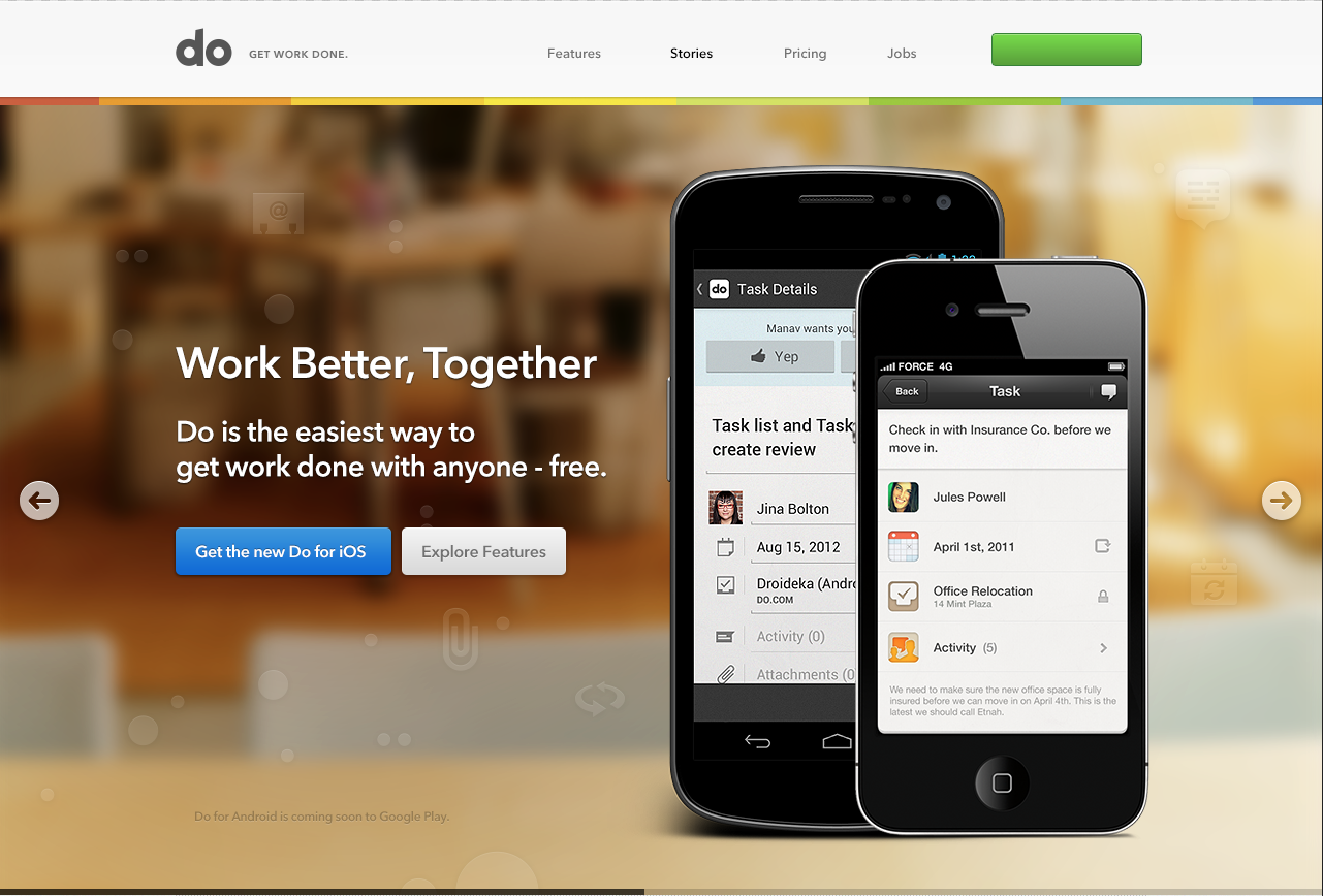
Finally getting around to some designs for our home page's carousel. (See the attached screenshot for the whole thing.)
July 31, 2012
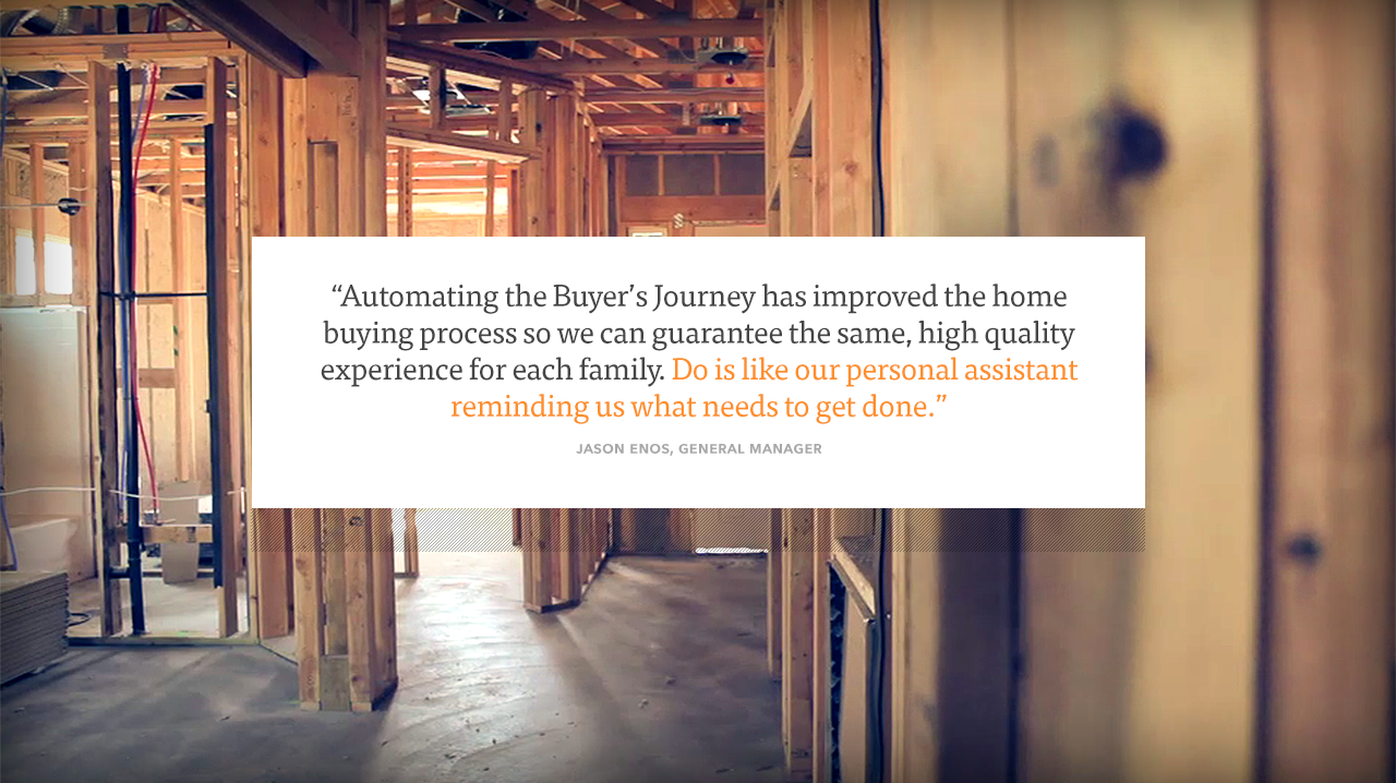
"Thousands of people use Do to stay productive – here are just a few."
July 27, 2012
shirts neue in new colors with a neue logo. neue. beats. battlestar galatica.
June 13, 2012
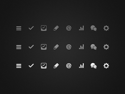
See attached for the full thing.
May 01, 2012
Now you can find Do on the Chrome Web Store.
April 25, 2012
I've liked the stuff we've done for Do marketing thus far, but I think its worth another look. What about something higher in contrast, higher in colour*? * Do uses British spelling for all internal objects. Colour, dialogue, etc.
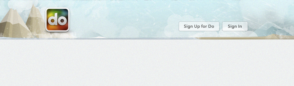
December 19, 2011
@sabrina suggested more muted mountains. Thoughts? Also attached, one with the ice at the bottom intact.
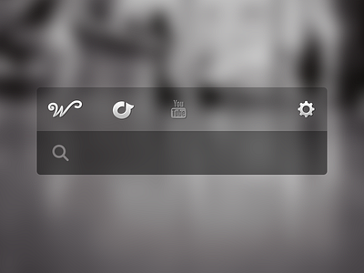
I dunno if I'll have time to implement it in time, but I thought this'd be a fun morning thing to work on.
Available for new projects
![A button for a carousel [WIP] button carousel ios marketing plastic slide tile web](https://cdn.dribbble.com/userupload/41629613/file/original-cbfd264a11913042d5252f39fd73ae65.png?resize=400x300)