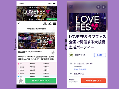
Japanese vs Western app style
I gave the Eventbrite branding treatment to the Japanese app "MachCon".
The Japanese app is basically the mobile site shrunken down and slapped on a smart phone. Very interesting unorthodox placement of the login button and hamburger menu. Two favorite buttons. Omnipresent promotional banner thats still present when checking out details of the event it's promoting.
The western app style is much more minimalist with clear visual hierarchy. However. less information and marketing type phrases are displayed.
Dear reader, which do you prefer?
More by Joel Lipton View profile
Like
