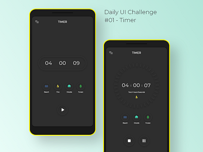
Daily UI Challenge - (01) Timer
Hey everyone !
This is a neumorphic timer concept created by me using Adobe Xd. It is a part of the 10 day UI challenge taken up by me.
I took up this challenge to enhance my UI skills and challenge myself daily by creating engaging, aesthetic and usable interfaces.
----------------------------------------------------------------
▪️ After conducting a detailed secondary research about the similar mobile apps in the market aimed at people ranging from teens to middle-aged adults, I analysed my findings and later proceeded with creating this concept. Mentioned below are the thoughts behind the decisions taken by me while conceptualising the experience.
▪️ One of the most interesting elements present in the design concept were a set of ambient sounds primarily of the ‘beach’, ‘fire’, ‘drizzle’ and ‘forest’. The intent of adding them was to allow the targeted persona to reduce anger, fear, and stress by generating a feeling of connectedness with the basic 5 elements of nature. Based on the scientific studies and personal understanding it was hypothesised that the users would feel less anxious about the count-down time once the sounds were auto-played by the app.
▪️ An ergonomically placed play & pause button would help users to take relevant actions in an instant. It was considered that coupling the shape-shifting micro-interaction of the timer and the neumorphic look and feel would invoke a realism effect within the users and they would feel more connected with the design concept due to its dynamic nature and responsiveness. The overall minimal UXUI would increase the user focus and reduce their cognitive load as only the relevant data points are present on the screen at all times.
----------------------------------------------------------------
Do check out my other work & let me know how y'all found this one ! 😄✌❤
