Japanese Cosmetic Website
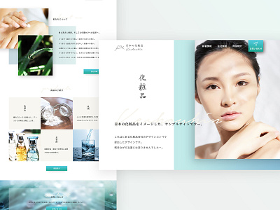
This is a design I created for a cosmetic brand as part of a competition in Japan. To maintain confidentiality, all references to the actual brand and products have been removed, and instead I designed an imitation logo and other elements for this project.
The design features a modern and sleek interface with a focus on showcasing the brand's products and creating a smooth and intuitive user experience. I used a soft blue color palette to evoke a sense of pure water, and combined bold typography with subtle shadows to create a visually appealing and engaging design that resonates with the brand's target audience.
More by Noriko G View profile
Like
