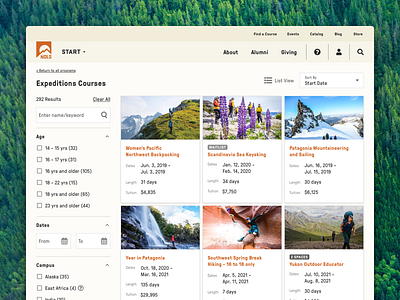
NOLS Course Finder - Expeditions (Grid View)
I’m excited to share my latest UI/UX design project for NOLS 🌲(and first Dribbble post! 👋🏻🎉).
Over the past year, I’ve had the pleasure of working on the NOLS creative team to totally overhaul the Course Finder, an advanced search tool on the NOLS website to help customers quickly locate and compare courses.
This screen shows course results for NOLS’s Expedition program in grid view.
Now that my UI is live on the site (as of yesterday 🔥), my team is going to dive into another round of user testing. I’m looking forward to finding more ways I can improve the design for our users (will follow up with any UI edits based on testing)! In a future iteration, I’m also hoping to play with the location of the “Waitlist” and “# Spaces” lozenges on grid view so that they don’t impact the scannability of the titles as much—it would be great to get the titles to align regardless of if they have a lozenge or not.
I’ll follow up next week with the Wilderness Medicine program in list view. Stay tuned!
📣Shoutouts
Project Management: Nikole Wohlmacher
Design Feedback: Kristen Lovelace
💖 Press L to show some love
