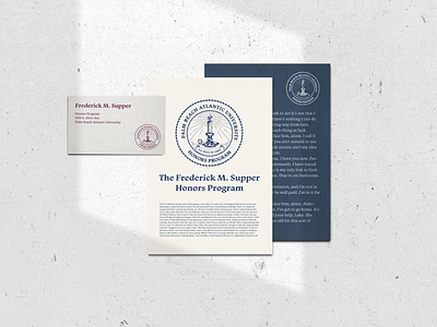
Honors Logo
Quick stationery mockup to test the PBA honors logo at different sizes. They were looking for a design that was overcrowded just like the old-school university seal designs, had a super vintage feel and was even a little on the lo-fi side. It was pretty interesting to design something against all my better instincts, but I think this quirky little seal fulfills its purpose pretty well. Shoutout to fillerama.io for the great filler text ;)
More by Rachel Boland View profile
Like
