Fintech


Financial Horizons was looking at redesigning the branding of their company. They were in the process of business transformation and wanted a new brand to help reflect that. Whilst they didn’t mind the existing colors, they were happy to move to completely new ones. “Family” was the key feature in their work and they sought to be friendly, comfortable, honest, trustworthy, and approachable. Based on the values given to us we choose blue and yellow to be the brand colors.
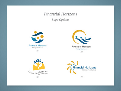
We gave them four logo options each resonating with the essence of the company. We explored logo options that had horizons and a family element to it.
RedAlkemi delivered the final logo which consisted of the elements of trust, and approachability. This mark represented a family. The shapes were designed to express the bond of a family. Colors blue and yellow represented comfort and friendliness.
After this, a brand guide was designed for them which was composed of color scheme, logo variations, and typography aligned to the concept of being a family-oriented business which is friendly and approachable.
RedAlkemi created business cards, email signature, and a presentation folder for them as part of their stationery kit based on the elements outlined in the brand guide.