Daily UI #024 | Boarding Pass
It was only recently when I flew for the first time in my life. I had a hard time finding my way around the airport—and the fact that the boarding pass I held wasn’t easy to read didn’t comfort me either. There was a lot of information cramped on the boarding pass. It looked very messy and I didn’t know where to look at first. I believe this was caused by a lack of visual hierarchy.
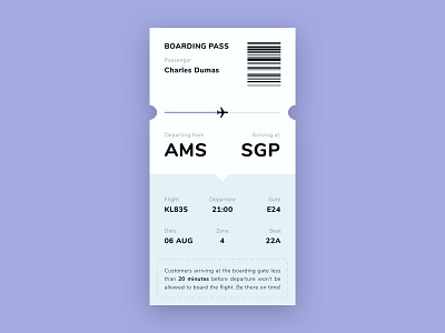
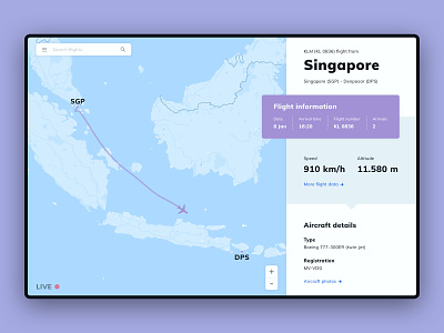
To solve this problem, I used the design style of my previous location tracker interface to design a boarding pass that should be easier to understand. I played with the layout of the boarding pass, and I carefully placed the elements in a logical order.
From top to bottom, the first thing that should become clear is whose boarding pass this is. This is the boarding pass of Charles Dumas. Great! We’ll gradually get to the more detailed details. Charles Dumas is apparently taking a flight from Amsterdam to Singapore. Now we know his flight, what about his seat? Or the gate? This detailed information follows right after.
This boarding pass design should comfort the traveller with a logical order of information—combined with proper visual hierarchy. Rather than firing all the possible information at the traveller at once.

