Vista Alpina Eye Center Logo

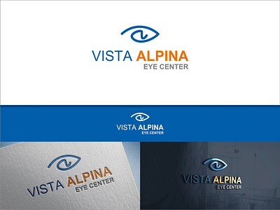
Our client needs a logo for their company, a vision care clinic called "Vista Alpina Eye Center". The client desires a simple and memorable logo. We proposed a lineart-style logo concept to meet the client's desire for a modern logo. The logo takes the form of an eye, with the letter "a" in the center to brand the word "Alpina" in the company name. This makes it easy for people to remember that it is a logo for an eye care clinic called "Alpina".
We selected blue as the primary color, with additional colors of orange and gray. Blue communicates a sense of safety and comfort for patients, orange indicates the spirit and optimism in providing the best eye care services, and gray conveys a sense of professionalism and seriousness in delivering high-quality eye health services.