Kacbar Crunchy

We would like to explain the logo that we created for UD Berkah Mandiri Indonesia for their product, Kacbar.
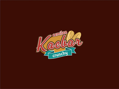
Our client, UD Berkah Mandiri Indonesia, needed a logo for their product called "Kacbar". Kacbar is a snack made from high-quality peanuts, processed by frying, with a savory and delicious taste. The client required a logo that is suitable for their product, visually appealing, and can stimulate one's appetite. They wanted to include the words "Cemilan Kacbar Crunchy" in the logo.
After discussing with the client, we proposed an emblem logo with a retro nuance. We used an oval shape as the background of the logo. We highlighted the word "Kacbar" as the main branding name and made the other two words smaller. We added a peanut icon to represent the product, and a ribbon as a decorative element for the logo.
For the color scheme, we chose red and brown. Red is an eye-catching color that can make the food look more appetizing. Brown can stimulate the product offered and represents the fried peanut content.