Skillshare - Logo Proposal
How’s everyone today?
Skillshare has published their new identity recently and to me, I thought they were going to take a different approach. As a consumer of their services I don’t feel that their new logo resonates with me that much.
The mixture of capital letters and lowercases shows certain inconsistency and looks a little bit unbalanced. Also, I did no expect that Skillshare will remove the symbol at all, I think they were recognised because of that and it was a key element of the brand.
This is just my opinion, on application the new identity system looks great but I was expecting something different, that’s why I wanted to design my proposal.
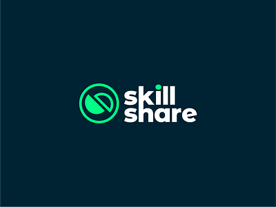
I tried to maintain their new identity keeping the same colours and style but adding my own touch to be more aligned with what I was expecting. The symbol is a simplification of the old one, 2 semi circles , totally filled (mentor) and incomplete (learner) coexist in the community to help each other by sharing skills and knowledge.
Are you agree or not? What’s your opinion on their new identity?
