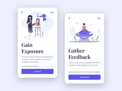
Daily UI #023 | Onboarding
There are different ways to create an onboarding experience. It could be in the form of a tooltip, embedded in the empty state of a product, or—like I did today—part of the sign-up flow.
This type of onboarding experience is used to introduce the user to the benefits of the app—which should build motivation and make the user excited to use the app. These screens are isolated from the rest of the app. And it should only be shown the first time a user uses the app to avoid repetition—which could cause irritation.
The ability to skip these steps has been added as well, to avoid losing impatient users.
Today I didn’t design to solve a problem. I designed to avoid them.
Also, big shout-out to @NinaLimpi for the beautiful illustrations!
More by Jeffrey Thümann View profile
Like
