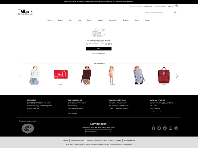
Empty Shopping Bag - Dillards.com
Before this page just said "Your shopping bag is empty." and it was a dead-end for the user. I created a custom SVG and put some call to action buttons so users could continue their shopping experience. Product recommendations were also placed at the bottom of the page.
More by Michelle Trostel View profile
Like
