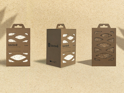
3 lavave perspective
New packaging and identity was developed for the sponges. Avoiding clichéd visuals of using leafs or green hues, the identity was made to feel clean and natural. Naming the sponge came from merging the word lavar and agave, then adding an accent for pronunciation. The brandmark came from combining the shape of the sponge with the forms of the agave bulb.
More by Daniel Piedra View profile
Like
