AVAVA Systems Website

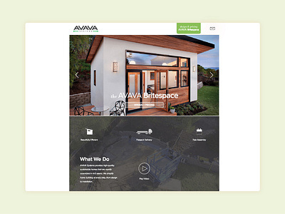


The goal for this startup website-on-a-budget was to make an incredibly simple landing page that also had some product functionality. I stripped down the UI to address only the core company and product education needs we were recognizing from our customer interactions, and created a "heads/tails" UX where the "front page" was a landing page with basic information and presentation of the company, and the "tails page" was a wholly dedicated product experience. Because there wasn't a lot of other stuff in various menus to draw away attention, it was easy to flip back and forth. The product page was really successful in engaging customers - it creatively answered everyone's biggest question: about how much will this cost - while allowing customers to get a curated overview for what was available, and play with the options before speaking further with the sales team.