M-1 Global
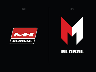
The M-1 logo became obsolete and required new thinking, a fresh, modern image. I tried to simplify the form as much as possible, make it more memorable, clearly indicate the color combinations. I got a sharp, sharp logo that conveys the spirit of fighting without rules. Looks great!
More by sontwerper View profile
Like
