Vivavim rebound
View @2x!
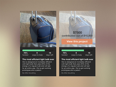
Hey Rebecca, thought this project was interesting and sucks you didn't get much feedback so I did a rebound :). In this redesign I wanted to leverage the power of the progress bar more as well as quick access to what projects are about. I felt the picture will draw people in as well as projects nearing completion. The person who created the project isn't as important as the rest so I put it at the bottom.
On hover I created a call to action. There are a few things I feel could be improved about this. The call to action should be visible without hover, however its hard to work with the spacing. Having it at the bottom of the entire card probably isn't too bad. Doing cards this way takes up more space but presents the user with 3 options while browsing the list of projects. Less choice definitely helps. Lastly, on hover, the 6 ways you can help should show. If I am a teacher or industry expert at something, a position might catch my eye, therefore getting me to click and show more interest in the project.
Would love to discuss more on if you felt this matched the style of what you were going for and if it further solved the goals of this page. Feedback welcome :)
