Leon Coronato & Đardin visual identity

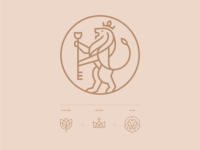
The main idea behind the logo is a combination of two symbols - a lion and a flower, which represent the synergy between the hotel and restaurant. The flower is used because of the restaurant’s name “Đardin” which is the Montenegrin word for “garden”, while a lion illustrates the name of the hotel - “Leon Coronato”, which translates to “crowned lion”. The primary colors of the hotel and restaurant are blue and green, where blue represents the spirit of the Mediterranean, and green reflects nature. The secondary color used in visual identity is light beige. It merges the two identities visually, and since the blue and green have cooler tones, it was necessary to add a warmer hue to achieve a more gentle feeling.
Check our full Behance presentation:
https://www.behance.net/gallery/87378903/Leon-Coronato-Dardin-visual-identity
Follow us on instagram:
https://www.instagram.com/artandcode/