Meads Heritage
Identity proposal for a local town council, focusing on a area called Meads.
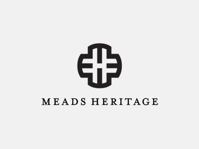
The mark is formed from 4 letter m's forming the outer ring, with the 'h' formed from the negative space, with a slight adjustment on the vertical.
Priority to create a simple yet bold and memorable mark that local residents and tourists alike can relate to. A mark that can be easily used on signs, adverts and any other form of marketing and advertising literature relevant to the project.
