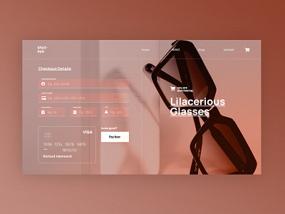
Glasses Credit Card Check Out - Website Design.
#DailyUI . What would you change? I reckon the credit card diagram could be removed all together its pretty much useless, i just like the way it looks visually for this shot.
More by Hyle Digital View profile
Like
