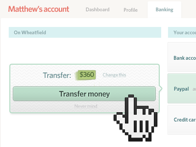
Money transfer with a twist
I despise my bank’s UI for money transfer. Drop downs with account numbers and so many text fields. Nicknames for accounts I always forget. Uncertain money direction. Scary confirmations.
This UI uses metaphor. The money turns into a receipt and points to the account you transfer. It’s simple and it’s obvious. And my grandmother is delighted by it and that is the best sign!
You have to see it in action, here.
It’s also a screenshot of my just-launched portfolio which uses a novelty-sized cursor to show interactions. Double debut dribbble!
More by Matt Pistachio View profile
Like
