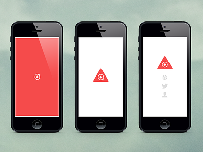
DFCO Splash Animated
Had a ton-o-fun building out this splash page for designfaith.co last weekend. Mostly, I just wanted to have something up (thats what she said) while I build out my full portfolio site.
The nifty part – no images are being used. Everything is SVG code (check the source on designfaith.co). Learned a tonnn about SVGs and I was actually really surprised with how easy they are to work with. Anyways, here are the pros/cons I found personally during the whole process:
Pros
– Completely scalable
– Easily editable with CSS
– Quickly rendered in browser
– No image requests
Cons
– Not supported by some browsers (cough, IE)
– Limited access to some attributes
Also, I think its funny the splash page fits in a dribbble shot. #crazyresponsive
Would love to hear your thoughts on the UX, animation, SVG's or whatever else :D

