Oonagh Hayes Branding

I met Oonagh through the Life & Deaf Association. She wanted a complete branding package: colours, logo and typography. I went through a few designs with her before we ended up with this logo.
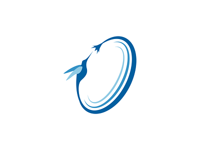
Her only real stipulation was the hummingbird - I liked the idea of incorporating it into the 'O' of her name, and came up with the concept of the flower and the bird being connected, as this reflects the ideology of her life coaching business.
The flower changed sizes several times, and although I started with quite a classical style Oonagh preferred something that was more corporate. This was my first lesson in client expectations, and understanding that a lot of the time the client doesn't know what they want until they see it. Initially all the lettering and colours were very modern and progressive, as this was the kind of thing she said she liked; but as soon as she saw the proposals Oonagh reacted strongly against them. I toned down and went for something more classic, but again she realised this wasn't what she wanted, and eventually we went modern again but not so progressive.