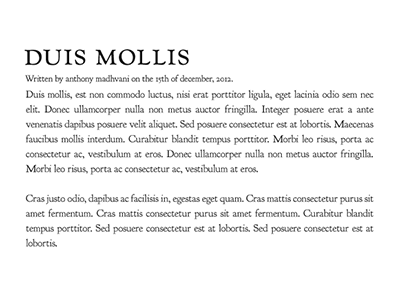
Typographic structure #1
Trying out some typographic structures.
Basic hierarchy is much harder than all the interesting stuff. Once you're in that rabbit's hole it's hard to free yourself from it. I'm not sure wether or not I should use a separate face for the meta information as it seems to degrade the cohesiveness a fair amount. In all though, I'm fairly satisfied with it.
(Yes, it's Goudy! If I ever want to implement this on the web I'll have to acquire a Typekit license, as the extended family isn't freely available.)
More by Anthony Madhvani View profile
Like
