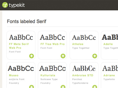
Typekit Grid View
I mean zero disrespect to the fine work already done by Typekit but I do think their category listings pages could benefit from the addition of a tighter viewing style. I roughly mocked-up this version of a grid view based on the current Serif listing.
With this format, they could fit 10 samples in the space that they current show 3 samples. So a page which currently lists 10 typefaces could list 30+ easily.
More by Davin Risk View profile
Like
