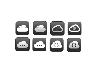
Fiddles Icon Possiblities
Since the UI in Fiddles is going to be black and white I'm trying to decide on a new app icon. I've come up with a few possibilities, but i can't decide which one to use. Part of me wants to apps ui to be a simple white on black theme. But then another part, says that the black and gray icon looks better. So I'm not quite sure looks better
So, my question to you guys is, which ones do you like most? Personally, I'm partial to 3,5 and 8.
FYI: Fiddles is the first iOS Client for jsFiddle, it'll allow you create little code snippets to test out web design features and functionality. You can create your code snippets with HTML,HAML,Markdown,CSS,LESS,SASS,CoffeeScript and Plain JS. And it's going to have a few other goodies as well :)
Follow @FiddlesApp on Twitter for updates
Planned release date is end of 2012 early 2013. Sorry, I keep pushing back the release date, but I want to make sure it is "perfect" before i release it.
