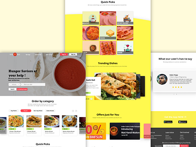
Food website
When it's a website depicting food, its better to use warm colours such as yellow and red which increases the hunger stimulation. Tried to play around and redesign an already existing website.
Constructive criticism is always accepted.
Cheers!
More by Subashish Batabyal View profile
Like
