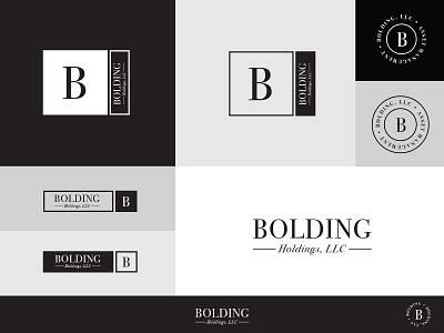
Bolding logo dribble 2
This was a quick logo I just finished. They wanted a simple timeless classic look. They didn't have a big budget, but I wanted to give them a Word Mark, and a few lockup to be used in various different environments. The colors I chose are very bold dark and light contrast.
Let me know what you think?
More by Patrick Hardy View profile
Like
