The Logo
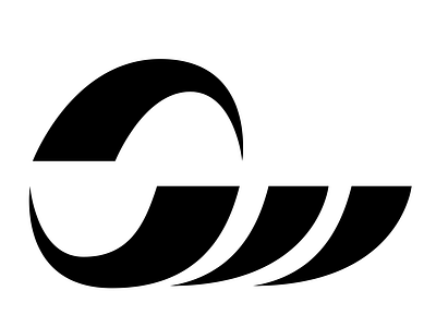
Had always wanted to explore a personal logo and tie together my initials. Early sketches were quite boxy with straight lines and angles until I played with the S a little more.
It is meant to represent how digital design & the internet is now constantly revolving in cycles but also our ability as designers to make waves.
It's hardly ground breaking but I like it.